Going static: Using Jekyll without a CMS
Migrating Made Mistakes from a Wordpress powered website back to its static file roots using Jekyll without a CMS.

If you follow the trends in modern web design and development, it’s hard to ignore the work being done around responsive design. Seems like every other week there is an awesome article about media queries, fluid grids, mobile first, or responsive images on websites like A List Apart and Smashing Magazine.
Which got me thinking “Shit. I don’t know anything about these new technologies or techniques, I better learn fast.” And the only real way I was going to pickup all this was to create a project for myself. So began the process of evaluating how to build my personal website and how I’d like it to function.
Why go static
For the last ten years I’ve used a CMS to hold and present various blogs and portfolios for myself and clients. These websites were all dynamically driven by a database (usually MySQL) and generally had more features I almost never needed. For example, the convenience of being able update a Wordpress powered website from an iOS app. As much as that feature sounds awesome, I never felt the need to post to my blog while away from my iMac. Especially not any sort of long form article or image heavy post.
A common problem facing Wordpress sites is the speed at which they serve up pages. To be honest I never really had issues with Made Mistakes because it was relatively small and low on the traffic. But worrying about security exploits, if updates to the core were going to break something, poorly written plugins, or if I had W3 Total Cache configured correctly started to get old fast.
Designers are control freaks
But the real reason that prompted me to look at going back to my web roots was control. Trying to tame content inside of a CMS filled with loops, functions, and code I didn’t write or completely understand became an exercise in wasting time. And for what? In six months I’d abandon a site and cease updating even though I had the tools to update from anywhere and at anytime. Which lead to this conclusion — I’d much rather build something from the ground up than strip away a bunch of useless bells & whistles I didn’t need.
Journey to a static website
And so began the process of building a blog-portfolio hybrid using vanilla HTML and CSS — no databases, no PHP. But where to start? Do I build a few disconnected pages in a text editor like Sublime Text and upload via FTP? Or is there a better way using a static-site generator like Jekyll, nanoc, Middleman, StaticMatic, Bonsai, and the list goes on?
Generating the site with Jekyll
I eventually settled on Jekyll as my static-site generator of choice — mostly because it seemed actively developed and Liquid appeared to support everything I needed to do with my templates. Publishing a new post goes something like this:
- Create a text file written in Markdown for a new post.
- Add a YAML Front Matter block to the top of these files to indicate which layout to use, the post’s meta data, feature image, category, and tags.
- Run
jekyllfrom the command line to spit out the compiled site. - Deploy
/_siteto my web server using a rake task that minifies all .html files, rsyncs the changes, and pings Google and Bing notifying them thatsitemap.xmlhas updated.
There can be a few more steps to the process, but for the most part it’s fairly straight forward after you’ve built all the necessary _layouts and _includes. What made this process appealing to me over Wordpress or another CMS was — total control. I can set how I want the folder structure to look like, how the pages are constructed, use Grunt and other build scripts to optimize everything, etc etc etc. Sure it’s possible to do all this in a CMS, but sometimes it’s not as transparent and obvious and you often have to strip out a bunch of code bloat.
I will say this about using Jekyll — it’s not for everyone. I had to get my hands dirty and figure out (or research) ways of creating XML sitemaps, RSS/Atom feeds, including social media buttons on article pages, and numerous other things Wordpress powered sites take for granted. But if you ask me, digging into those details and crafting something from scratch was way more rewarding than installing a plugin to do it for you.
Jekyll made it possible for me to realize the following goals: familiarize myself with the basics of HTML5 and CSS3 transitions, be able to “art direct” every page without hacks, get nice with CSS preprocessors like Less to create more powerful and efficient stylesheets, and plant the seeds of a responsive design that was optimized for mobile, tablet, and desktop screens.
Inspirational frameworks
HTML5 Boilerplate
One of the most beneficial things I did to familiarize myself with the HTML5 spec was download the HTML5 Boilerplate and read through the source code. All of the files are heavily commented and explain what is going on and why. Often with links to the source material to get more context behind a specific technique or approach. When this wasn’t enough I’d hit up HTML5 Doctor to learn more about the header, article, section, nav, footer, figure elements.
Art directed blog posts are so passé
Back when I still had a website powered by Wordpress, I toyed with the idea of designing art directed blog posts. Essentially posts that deviated from the blog’s theme and became something unique based on the posts content. Think of the editorial design work done in print magazines and you’ll get the idea.
To achieve this you could install any number of art direction Wordpress plugins to include custom CSS styles into a post’s layout overriding the defaults. If you ask me, using Liquid flow tags in a templates seems less hacky and way more customizable. Loading custom CSS for specific pages becomes an almost trivial exercise once you wrap your head around Liquid and YAML.
Less is more
When I first heard about Less and Sass I rejected the idea of using a CSS preprocessor. Feeling like I’ve sharpened my CSS skills to a razor sharp edge, I in no way wanted to add another layer of complexity to my workflow. With a second look I decided it made a lot of sense to at least experiment with writing Less and see how I could utilize it in my next project.
Bare minimum I figured I could use global variables for the site’s color palette and default typography and maybe a mixin or two. The beauty of Less is that you don’t have to alter your current .css files. Just changed the .css extension to .less and you’re done. Then use as little or as less that you want.
Using variables and mixins helped to quickly prototype page styles. It also allowed me to think more modularly about how to best reuse my code throughout a project. And I didn’t even have to worry about using JavaScript or a separate app to convert compiled .css files. I simply installed the Jekyll-less Ruby Gem and any time I run jekyll or jekyll-server, the .less to .css conversion is handled automatically.
But what about the grid system?
Another added benefit of using Less are the many user created mixins. I knew I wanted an easy way to establish a grid system in my layouts, but really didn’t want to go the semantically unfriendly route of using classes like .grid_x, .push_x, or col_x. Instead I stumbled upon The Semantic Grid System from an article on Smashing Magazine about using semantic markup in grid frameworks.
Using The Semantic Grid System allowed me to define fluid grids for each of my site’s major page layouts with a few lines of Less. Top that off with a few carefully thought out @media queries and my grids were now responsive and adapted well mobile phones, tablets, desktops, and beyond.
Left to do
So now that I finally got around to migrating my Wordpress website, developed a process for publishing content, redesigned everything from the ground up, tinkered with responsive web design, and learned some new tricks… what’s next? Well for starters, I need to finish cleaning-up and re-publishing around fifty old blog posts. Many of these originated from Tumblr and Wordpress, and when I migrated them over to Jekyll the outputted files were a mess. Plus I’d like to design some of these pages to make them visually interesting.
Portfolio layout
You might have noticed in the main navigation up top (or maybe you didn’t) a coming soon line next to the portfolio link. Still thinking about how I want to showcase my design and illustration work that fits in well with the rest of the website. I did some tests on the Work page using a grid of thumbnails to represent each post that I think will work better as a portfolio. Either that or combination of a responsive slider for featured work and smaller thumbnails below for the rest. We’ll see…
Responsive images
I think I have a solid handle on how to serve mobile optimized pages using @media queries and page widths. But what I don’t have figured out are the images. Sure they scale and look decent at various breakpoints, but I didn’t exactly follow a mobile first methodology with them. I started big and scaled down, which means the iPhone and other mobile devices download large images regardless. Something tells me cracking this nut is going to be hard.
Version control
With a 1.0 release under my belt, I think now is the time to take a look at creating a repository on GitHub. Maybe to bring sanity to the project allowing me to version control each update. Also think it would be wise to learn how to utilize rsync and rake tasks to make deploying smoother instead of manually FTPing the contents of _site\ to the server.
Jekyll themes
Getting more comfortable using Jekyll I wanted to give back to the community, so I’ve released a few Jekyll themes on GitHub. I’ve taken the numerous redesigns this site has gone through and packaged them up into something I hope is a good starting point for launching a Jekyll powered blog. And they’re all 100% compatible with GitHub Pages if you’re looking for somewhere free to host your site or blog.
9 mentions

If you’re still looking for a responsive image solution for Jekyll I’ve just finished a plugin called Jekyll Picture Tag. Any feedback appreciated.
Depends on how large the site is. I have around 700 posts and it takes a few minutes to build the site. It can also depend on the sort of
_plugins, using related posts, the various generators you have going too, etc. If you it’s a basic site with under 50 posts it should build really fast.It can get kind of bothersome if you’re writing new posts and want to view them locally before deploying, since it has to rebuild the entire site. In that case you can tell Jekyll to limit it’s build to X amount of posts. I usually run it with
jekyll build --limit_posts 10to see the latest 10 posts. That builds fast and allows me to test before I do a full site build.Pretty sure it’s on the radar of the Jekyll folks to address this issue. But probably won’t happen anytime soon.
Thanks for the feedback Michael, I agree with you, at first it seems not a good idea. I’ve seen on Paul Stamatiou’s site a good article on this subject and he finishes linking to some patch that allows Jekyll to do incremental regenerations.
Maybe this could be useful, regards! ;)
Related
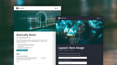
Basically Basic
Minimal Mistakes

Skinny Bones