Collecting records for the artwork
Most of the records I purchased in the late 90’s–early 2000’s were self-released or put out by small independent labels.
Hand lettered, the stuff of my dreams
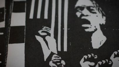
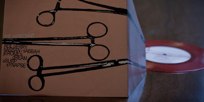
Looking back, my favorite sleeves and liner note designs all shared a common element — they were created by hand and printed in black and white. Which is an interesting comparison to the digital world of today, were kids have access to sophisticated desktop publishing software, and affordable means to print full color on a range of paper stocks.
Anything but the Swiss
Thumbing through boxes of dusty hardcore and emo records, it’s easy to see where many of my early aesthetics drew inspiration from. In college I tired of the Swiss style every one of my peers was regurgitating in Typography I and II. What excited me more, was mashing analog approaches of zine and DIY record packaging design with refined digital methods and craftsmanship. Focusing less on the gloss and more on the method, gave me a greater appreciation of texture and how to communicate with it.
Instead of embarrassing myself with examples of my early fumbles as a graphic designer — I’d like to share inspirational fragments from my record collection. With over 500 LP’s and 45’s, I’m sure I can find plenty of material to critique and comment on.
More to come
Just finished capturing some photographs of artwork that ranges from black/white ink drawings, fancy die-cuts, to sleeves printed on vellum with metallic inks…
Related

Corn On Macabre record art — vellum and metallic ink bliss
My About.me profile
Urban Outfitters, ya typography dun goofed again