Drawing and painting basics
Learn the basics of iPad drawing and painting with the app Paper by WeTransfer (formerly 53).

In this guide I cover how to use Paper’s digital pencil, watercolor, and ink tools and techniques to emulate their real world counterparts.
Presented in a beginner friendly manner with small tutorials showing all the steps and examples along the way.
Pencil techniques
I once described Paper’s digital pencil tool as versatile and perfect in almost any situation. When used in conjunction with a Pogo Connect or FiftyThree’s Pencil stylus, those sentiments ring even truer. So what exactly can you do with the tool?
Painting with pencil
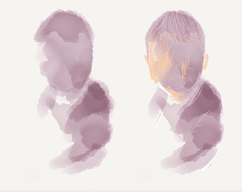
Learning how to produce a continuous tone with the pencil tool is a worthwhile endeavor that I encourage you to practice. Once mastered you will have the skill needed to fade values into one another and model forms three dimensionally.
A couple of points to keep in mind for creating an even tone.
- Work in one direction moving parallel along the iPad’s screen (example: up/down, left/right).
- Don’t be tempted to overwork and area — keep moving at a steady pace.
- If you are using an iPad stylus with a sensitive tip (e.g., a Pogo Connect), don’t vary the amount of pressure you apply — keep it constant and light unless you’re trying to fade the tone.
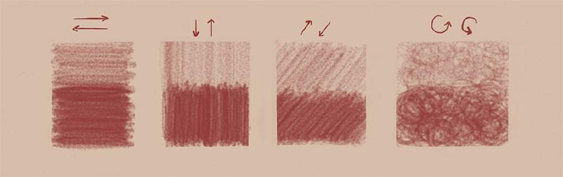
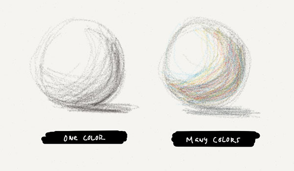
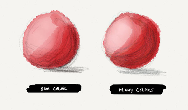
Once you’ve gotten the hang of shading a range of smooth values, it can be fun to add more colors. Colors can be dry blended by overlapping pencil strokes directly on Paper’s canvas, giving the impression that they’ve been mixed together — just like on real paper.
Ink techniques
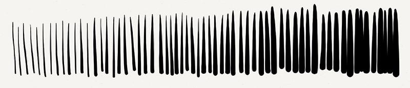
Out of the two ink tools that Paper comes with, the pen (or Write as FiftyThree calls it) is much easier to produce consistent results with. Stroke speed and pressure do little to modify the line quality which allows you to focus more on accuracy and stroke placement.
Paper’s fountain pen on the other hand can make drawing a line without weight fluctuations incredibly challenging — as shown below.
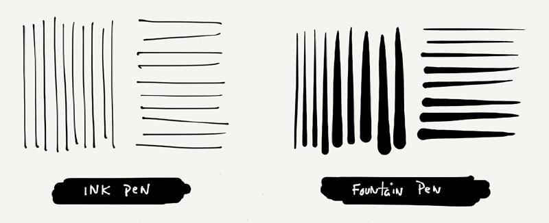
By all means use whatever tool you’re most comfortable with. If you’re new to drawing digitally on an iPad and just want to practice the following techniques, do yourself a solid and stick with the ink pen.
There are many techniques for suggesting light and shadow when drawing with ink but they all follow the same general principle. Draw marks where there are shadows, and leave the canvas blank where there are highlights.
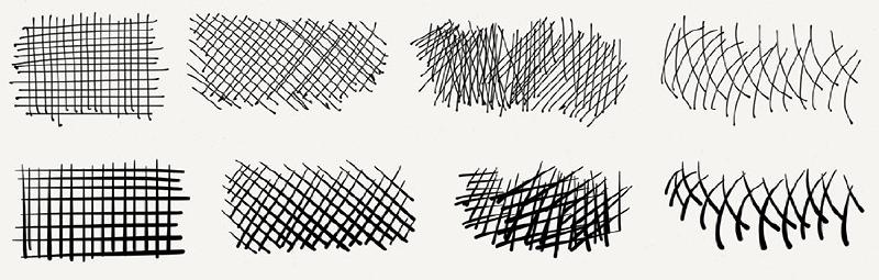
Parallel hatching
As the name implies, the lines you will be making should run parallel to each other. These lines can be vertical, horizontal, or at an angle — pick one and stick with it throughout the drawing. By drawing lines closer together they will appear to blend and create the illusion of being darker.
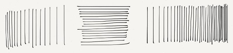
Another way to modify the overall tone created by these lines is to vary their thickness. Because you’re using digital tools you need to leverage Paper’s software to fake this effect.
By using the app’s fountain pen you can create thicker lines by pressing harder (if using a smart pen like Apple’s Pencil) or making quick swipes (if you’re using your finger).
Contour hatching
If you’re feeling confident and have honed your powers of observation by drawing blind contours, you should be ready to attempt contour hatching. Instead of making straight marks like we did with the parallel hatching exercise, you will draw lines that follow the curved contours of your subject.
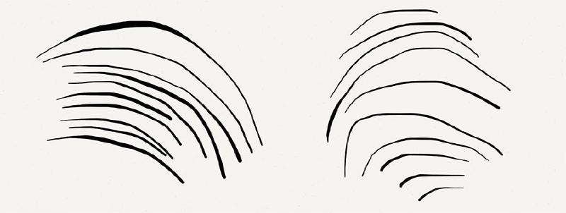
Personally I don’t often have the patience required to create an accurate drawing using this technique. When done well contour hatching will enhance the form of your subject and make it appear more three dimensional.
Cross hatching
Cross hatching is what you’d expect, hatch marks that cross one another. It’s an effective way to quickly darken or shade a subject. I like to use the parallel hatching technique and build on that by crossing the lines at a slight angle. Contour lines can also be crossed for more life like results.
Stippling
Instead of using lines to create tone and texture, you make small marks on the Paper’s canvas. Much like the hatching techniques described above you vary the tone by increasing the density of these marks — the higher the concentration the darker the tone.
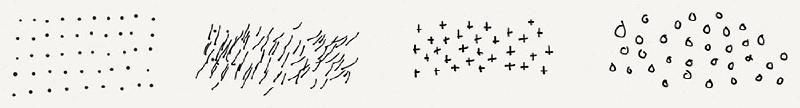
The placement of these marks can be as expressive or as precise as you want. I prefer to be loose and free, but don’t let that limit what feels right to you. Stippling marks can be anything you want — short ticks, dots, crosses, circles. And they can even be combined with hatching to add detail and enhance the effect.
Ink blobs and drips
By using Paper’s digital ink pens and pencil you can simulate ink splatter, blobs, and dribs. The idea here is to recreate those happy mistakes that may appear randomly when working with analog tools. To start create a grouping of small circles and dots using Paper’s fountain pen.
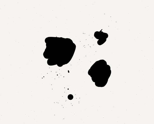
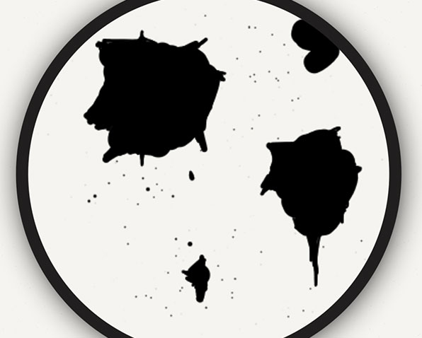
To make these shapes more irregular, zoom in and distort their shape by adding bumps and points along the edges. You don’t have to overdo this step — small variations here and there will do the trick.
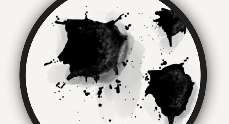
Adding shadows and highlights with the pencil tool can make these shapes pop off the canvas. Draw a few dark strokes on one side of the blob, and then using a lighter color, draw a highlight on the opposite side. Depending on how thick of a blob you are going for you may want to add a cast shadow with the pencil or watercolor brush… filling it with a light gray color.
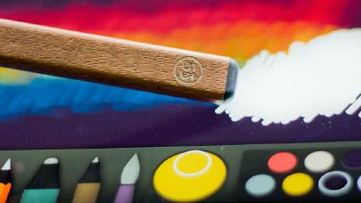
Watercolor brush techniques
I’m going to go ahead and assume you’ve already read my Paper by 53 Introduction and Tool Guide, where I explain how the Paper’s digital brush works and some of its nuances. With this understanding the following four techniques should make more sense.
Painting smooth
The question that hits my inbox the most is “how do you paint so smoothly on iPad?” Well here’s my secret. Paint a continuous stroke, without lifting your finger or stylus of the iPad’s screen. If you lift and dab an area multiple times it will darken and turn bumpy in Paper app — you don’t want that to happen!
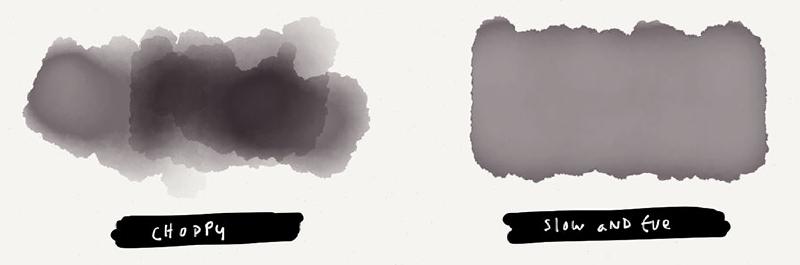
The other important variable to consider is moving your finger (or stylus) across the iPad’s screen slowly. If you rub in a circle motion on an area that is light it will eventually darken to its maximum darkness point. As long as you don’t lift as you circle over these lighter spots on the iPad’s screen, the shape and color will even out.
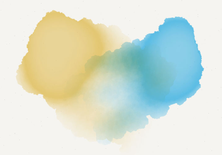
Feathering edges
Reliably creating an edge that is soft and blurry becomes important when blending digitally painted shapes together. To achieve this desired result you need to gradually increase the speed of your stroke as you approach the shape’s edge you want to feather out.
A digital wet-on-wet effect can be simulated by feathering brush strokes into each other. Getting the perfect fade can be tricky, so don’t be afraid to use Paper’s rewind undo and trying again. I almost never get it right the first time.
Lightening with white
When filled with white, Paper’s watercolor brush has the unique ability of lightening previously painted or drawn areas. This can be an effective way of pulling highlights out of your subject or to erase mistakes.
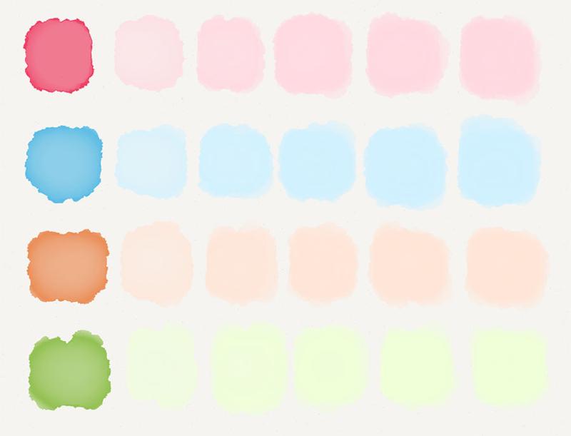
In Paper, white paint behaves slightly different from the other colors available in the mixer and default palettes. Much like painting with pure black it fills in quickly. Which means if you use it to paint, you have to move fast or risk completely covering up anything you paint over with white.
Glazing
When painting with the Paper’s digital brush you are essentially spreading layers of transparent color (or glaze1) on top of each other. These glazes don’t actually mix with one another, but because they are translucent, colors can appear to combine when layered. Glazes also have the benefit of increasing the depth and brightness (luminosity) of a color with each successive layer.
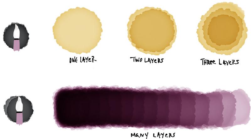
I like to think of glazes as my color harmonizers that tint everything with a similar hue. This is a great technique when working digitally to help tie a composition together if the original colors aren’t working together.
Underpainting
If glazes are applied on top of a painting or drawing, underpaintings are the layers applied below. They are most often used to pre-tone the canvas by removing white from it. The color(s) you choose can have a profound effect on the digital pigments and strokes applied on top of them.
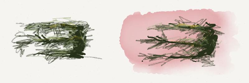
For example, contrasting colors can create some vibrancy in the scene. A lush landscape filled with a cool sky and green trees, pre-toned with a reddish glaze will cause the space around the leaves to shine through. Much more than if the canvas was left white.
Or you can tone the canvas with the composition’s dominant color. When doing detail work you won’t have to worrying about covering up the bits of white canvas that show through. The background will roughly match what you are painting as your main subject, saving you precious time.
An underpainting layer can also be used to establish the correct values and confirm the composition of your subject. Think of it as sketching with the brush, but instead of making contour lines you are blocking out rough shapes of value to capture your subject.
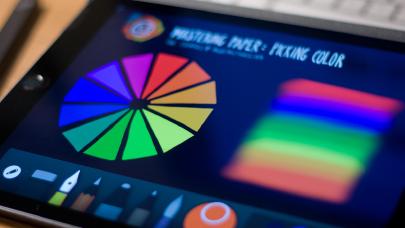
Color theory basics
Primary colors
Thinking back to elementary school you probably heard the term primary color thrown around. The idea I latched on to was that it should be possible to mix every other color from the primaries. Traditionally these three primary colors have been red, yellow, and blue.
Now I wouldn’t go as far as suggesting you mix primary colors on a digital canvas2 to produce secondary and tertiary colors, but it’s worth understanding how they’re made on a normal palette.
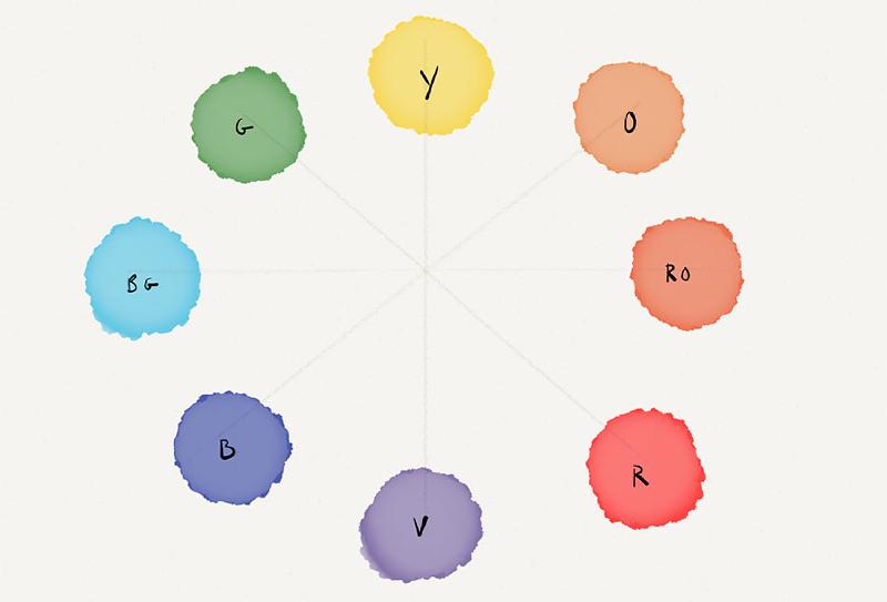
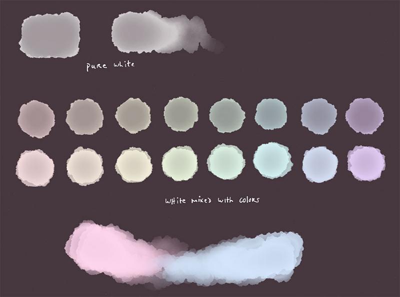
Complementary colors and grays
On the traditional color wheel complementary colors are across from each other (red and green, blue and orange, yellow and violet). When complements are mixed together, they should result in a neutral gray.
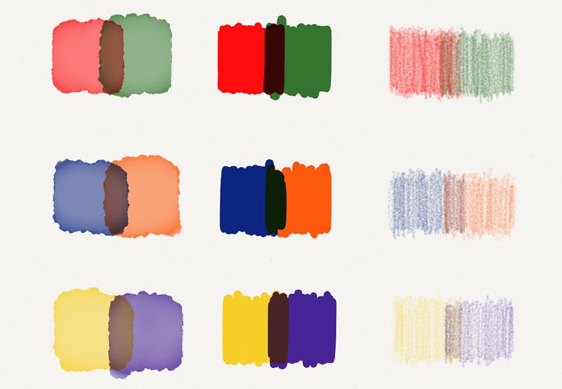
Since mixing complements visually on canvas doesn’t result in a neutral gray in Paper, we can mix them another way. The results aren’t quite the same as if you were mixing oil paints on a real palette, but they get the job done. Here’s how I do it:
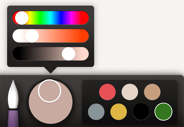
Select the two complementary colors you wish to mix and put one in the Color Mixer by dragging it over, and the other in one of your open palette slots.
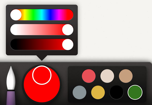
To neutralize them, do one full rotation of the Color Mixer with both complementary colors selected.
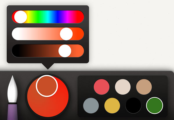
Finally tap the color in the Mixer and slide the saturation (middle bar) down somewhere between 10–20% to dull it.
I’ve found that instead of mixing grays from white and black, it is more pleasing to mix them from pairs of complementary colors. This gives you a limitless amount of “grays” to pull from for your palettes.
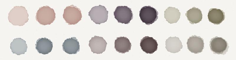
Mixing complements also helps to unify your composition’s palette. Using these “neutral grays” as glazes and layering them on top of each other is a useful way for making shadows.
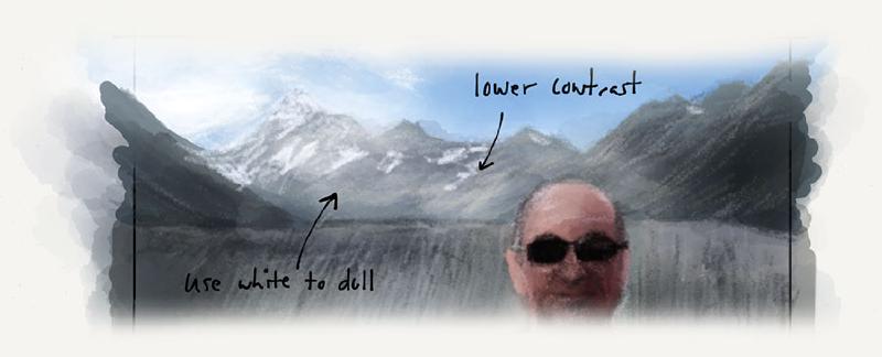
Atmospheric perspective
Atmospheric perspective is the phenomenon where intense foreground colors gradually change until they match the sky. As you travel back objects generally lose saturation in color, becoming grayer. For example warm colors like red and orange will dull and cool off.
The amount of contrast in the subject also changes. The illuminated and shadowed sides of an object lower in contrast and flatten as you move further into the background. These objects also begin to loss clarity and will blur and become fuzzy — an effect we can replicated with Paper’s Blend tool.
Well there you have it. Armed with these digital art tutorials on pencil shading, ink techniques, watercolor glazing, and the basics of color theory, you’re ready to jump into the rest of my Mastering Paper series.
Glazing is a watercolor technique that uses a thin, transparent pigment applied over dry existing washes. Its purpose is to adjust the color and tone of the underlying wash. ↩︎
Visually mixing colors directly on canvas can be fun, but the results aren’t always the best. I suggest using Paper’s Color Mixer instead since you’ll achieve more vibrant hues. ↩︎
22 mentions

I’ve noticed that painting with the Pencil stylus allows you paint faster and does seem to produce a smoother tone easier, but the same effect is possible using just your finger.
Try moving in a small circular pattern as you paint, it will help even things. And of course do not lift your finger off the screen or else you’ll start to darken areas and won’t get that smooth tone.
Other than that keep practicing.
There’s not much more to the process than what I included above.
- Use the pen tools to create the general shape and fill it in.
- Add some dots of various sizes around it to simulate the splatter.
- To make some blobs look more 3D add highlights using white or another light color with the pencil tool.
- To finish it off add a drop shadow with a light gray and the watercolor brush, zoom in, and paint quickly along the edge where you want to cast a shadow.
My pleasure, Michael. I posted a couple of links to your articles on a blog I wrote a couple of months back so my readers can find them.
Hi Michael I’ve never found anything that makes the transition from pencil and paper to digital that is so effortless. More so because of your great tutorials. I have a question on neutralizing colors by mixing with complement. I dragged the small circle around the color mixer with the compliment also selected but I didn’t see a difference. Perhaps I’m misunderstanding the instruction: “To neutralize them, do one full rotation of the Color Mixer with both complementary colors selected.”
My Pencil by 53 is on the way, but I’m learning while using my finger and another stylus.
Do you have any advice about different papers for ball pens. Ball ROller Gel and Felt I doodle. But some papers are way better than others and I’m having difficulty figuring out . I have come across newsprint (like the wight of a daily paper. But no idea where to get more. Or even what words I us to search for it. any help will be appreciated

Related
How to use Paper's color picker
Mastering Mix by FiftyThree
How to undo and erase in Paper