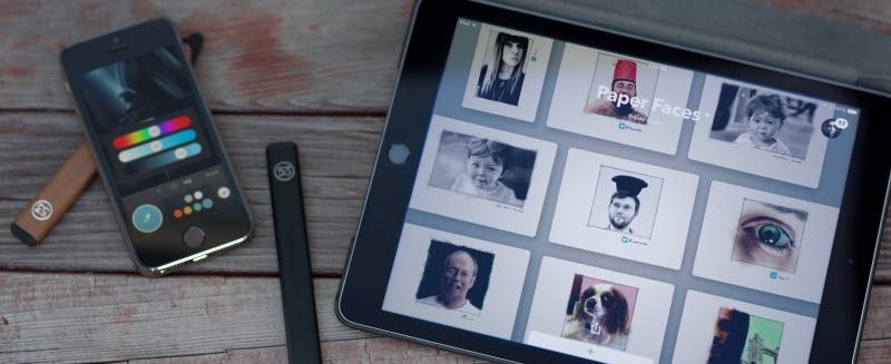
Paper v3.0 features
The hashtag #CreateAnywhere takes on greater meaning now that Paper by FiftyThree is available for iPhone — a device I always have with me. Not only that, but with a new set of tricks up its sleeve, Paper is quickly becoming a productivity powerhouse.
Here’s some of my favorite additions found in the 3.0 update…
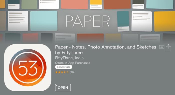
Universal Paper App
Yes, you’ve read correctly — Paper is now a universal iOS app that works on both iPad and iPhone. Every time I open Paper on my iPhone 5s I’m amazed that the features found on the iPad version all made the journey over.
Much like the complete UI overhaul in version 1.6.1, I got the sense that the team at FiftyThree re-evaluated every bit of the app for 3.0. Even if that meant modifying Paper’s defining characteristics1 to make the experience more intuitive and fluid.
Importing images
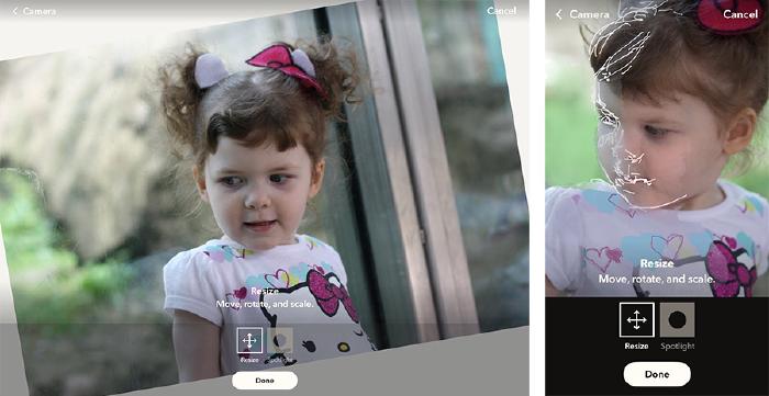
Love it or hate it (stick me in the love it camp), you can finally import images into Paper by FiftyThree! Tap the camera icon and you can either snap a picture or choose one from your photo library to place on the canvas.
You are limited to one photo per idea — but you can scale it, rotate it, and even call-out an area of interest with a new Spotlight option.
I’m excited to use this feature as a sketching aid — drawing directly on reference images I’ve imported into Paper. There’s no way to toggle this layer off yet (psst… FiftyThree engineers if you’re reading), but it’s easy enough to remove if you want to leave behind just what you’ve drawn or painted.
Tap and hold on the Eraser tool, tap Clear Photo, and poof!
Rotating ideas
What a time saver this one is. If you wanted to share ideas “right side up” you had to export to the camera roll to make the rotation edit. This worked OK for sharing on social media but not so much with drawings shared on Mix.

In 3.0 there’s a new button conveniently located below each idea for rotating the canvas in 90 degree intervals. Horizontal and vertical ideas live in harmony together because of the new grid view. Which leads me to my next favorite thing in Paper 3.0…
View ideas horizontally or vertically with the tap of the new rotate button.
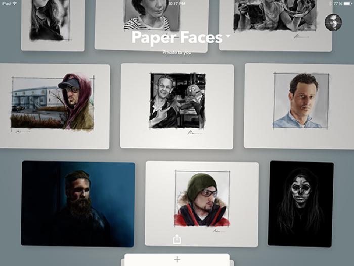
Journals replaced with “Spaces”
Paging through Paper’s digital journals might have been a good idea years ago, but with page counts in the hundreds it becomes unusable. Journals transitioning into “Spaces” is one of the best things to happen to Paper since the introduction of Think Kit.
Instead of ideas bound together as books, they’re presented with a different UI metaphor — stacks of paper. These stacks expand into an aligned grid of cards you can interact with when tapped on.
I’ll tell you this much, scrolling through ideas in this way sure beats flipping back 500 plus pages to find a drawing I worked on a year ago.
These new “Spaces” are more accommodating of the new content types found in Paper 3.0 as well. Ideas in portrait or landscape orientation fit in perfectly with text notes and images.
There’s no way any of this would be usable or look half as good as it does now if FiftyThree stuck with the book/journal motif.
Other new additions
In my short time with the new iPad and iPhone versions I’ve come across a couple of other refinements that should make the app more pleasant to use. Feel free to add any you’ve discovered in the comment section below.
Popular gestures have dedicated buttons now
Undoing mistakes and page management are some of the most common Paper actions I get questions about. In my experience most people had no clue you could do either — so I’m happy to see they’re more discoverable now.
Undoing (Rewinding) can still be triggered with a gesture2 or by tapping the new « button found in the tool tray. Tap the button to step back an edit at a time or hold down to speed it up.
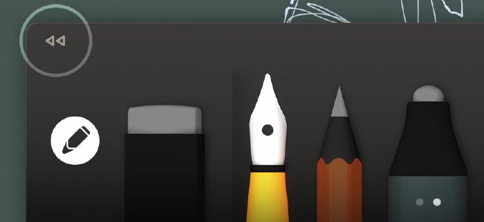
The • • • button below each idea allows you to delete, duplicate, and move pages now. You no longer have to tap and hold an idea with one hand and do finger gymnastics with the other to move things around.

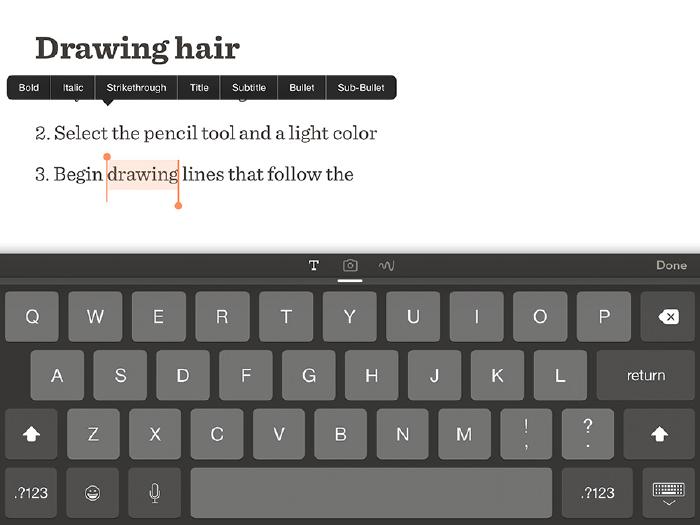
Ability to annotate ideas and create text notes
Perfect for to-do lists, recipes, or adding captions to your ideas and photos. I could see this coming in handy for providing context around an idea you’ve shared or to solicit feedback from followers.
Basic formatting of text can be achieved by swiping across text to cycle through styles (Title, Subtitle, Bullet, and Sub-Bullet). You can also bold, italicize, and strikethrough text by selecting it and tapping the right arrow followed by Style.
Changing the default idea type
You can switch between idea types (Canvas/Photo/Text) by tapping their corresponding icons in the tool tray. But you can also change which type is used as the default when creating a new idea.
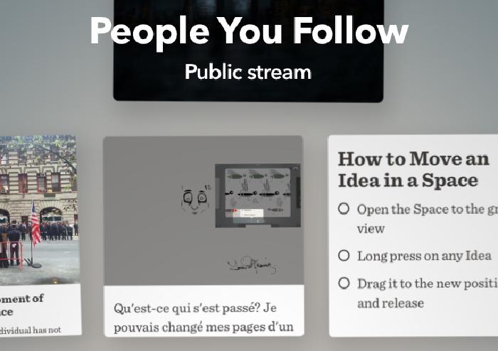
Formerly known As Mix
Mix is no longer something you “pull down” to access from within Paper. The stream of ideas from the People You Follow on Mix (or should I say PAPER now?) now appear alongside your private spaces for quicker access.
OK, back to lusting over the new Apple Pencil and waiting for the day Apple brings that technology to the smaller and cheaper iPads.
Yes the journal book view and zoom loupe have gone away. Change is good, deal with it. ↩︎
A small adjustment was made to the way Rewind works. To trigger it tap once with 2 fingers anywhere on the screen before making the circle gesture. ↩︎
4 comments
Thank you for this review! Usually, I just pick up the new features as I stumble across them and then play with how I might use them. I found your MASTERING PAPER series last year and became an avid (silent) fan…* : )
Wow! This review is amazing! Looks like I haven’t got the best of it out yet~
I owe you a debt of gratitude for this blog, but I’ll come right out and say that this sounds like sponsored PR hogwash to me. When I got my fifty three pencil I decided to learn how to draw all over again more naturally (without layers).
I’d had paper before the pencil, I’d used it before and it was great, but pairing Paper with pencil took the experience to a whole new level. Making strokes with the tip, flipping it over to erase, blending and even using palm grip (I’d never used palm grip in my life. Not even with real pencils) and then there was the time you could export and get your journal printed. How awesome was that? Say what you will about the journals, they are most impressive (And really? You’d draw in the same journal for a year?) Paper didn’t feel like an app. It felt like…Paper. Real paper. Now all that is gone, and it’s been replaced by this…ordinary note taking app which is fine (because I found a backed up older version and reinstalled it).
My point I do not believe there’s an artist alive who experienced the magic of paper and is excited by features that existed in MS paint. The new features are more geared towards note taking than artistic expression - spotlight, annotation etc… Paper is not paper anymore. It’s just another soulless app. A big big shame.
Agree about all the note taking features added, I use none of them and prefer more powerful apps like Evernote for that sort of thing.
The journal UI switch is a matter of preference I think. I don’t disagree that Paper had some growing pains when 3.0 launched, but most of those have been addressed in recent updates. I personally like to organize my thousands of sketches into a few journals vs. hundreds of smaller journals.
I accept that I’m not the norm since I seriously doubt the average Paper user has as many sketches as I have. Being able to scroll throw a grid view to find something is way more usable to me then the old tedious way of flipping page by page. And even if I broke a journal of 100+ pages into several smaller ones you now have the added problem of remembering what journal you stuck a sketch in.
And that’s not even addressing the problems with the old journals and how they’d often accidentally flip to a new page when drawing near the canvas’ edge. Sure the Moleskine look is gone but if you ask me that was a necessary change to make the app usable on both iPad and iPhone.
At the end of the day I care most about how the actual pens, pencil, and watercolor tools function. None of that was messed with. Everything else is either icing on the cake or a distraction depending on your perspective. If you don’t like the social stuff don’t use it, note taking and picture import… don’t use it.
I get why people are upset with the core stuff being changed or removed, but the addition of new tools and features? Not a big deal if you ask me.
That’s a bummer on the Book printing feature being killed. I wrongly assumed it was still available since there’s an option to “Print Book” when in journal view, but it just goes to a currently unavailable page. Not sure if that’s permanent or what.