CSS blur effect
Playing with the new Depth Effect (aka fauxkeh) on my iPhone 7 Plus got me thinking about Gaussian blurs, and how to improve their use on this site.
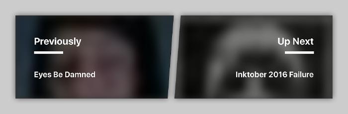
In this last redesign, I applied a blurred effect to images in a few key locations1. To keep page speed in check I shrunk images down to ~20px wide, optimized them with imagemin, and then scaled them up with background-size: cover to fill their parent containers.
The browser does the rest, enlarging and smoothing out these tiny images — creating a blurred effect of sorts. For the most part they look good. On devices that display @2x or higher, blotchy patterns and artifacts begin to show their ugly faces.

This is where CSS filter functions like blur come into play. By adding a single line to my stylesheet I was able to smoothen out these images just enough to overcome the ugly.
.teaser__bg {
  position: absolute;
  top: 0;
  right: 0;
  bottom: 0;
  left: 0;
+ filter: blur(15px);
  background-repeat: no-repeat;
  background-size: cover;
}
The best part, browser support for CSS filter effects is quite good.
Cover images with a striped pattern overlay. Background images in the post pagination links found at the bottom of each page. ↩︎
Tags: TILWeb development