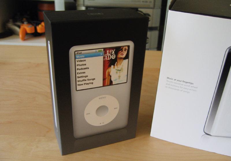
One week with the new iPod classic
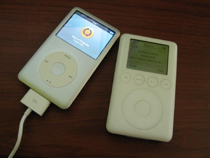
Last week Apple finally unveiled a new generation of iPods. The last iPod I purchased was a 3rd generation model with 40GB of hard drive space and have been waiting for a decent successor. My iTunes Music Library has finally outgrown the 3rd gen so I decided this was the time to get a replacement. I figured an iPod that resembled the iPhone would be just around the corner and pleasantly surprised when the iPod touch was announced.
At 16GB the iPod touch doesn’t meet my needs, so I decided to go with the new iPod classic 80GB model. Hopefully by then flash drive prices comes down and I can get a version of the iPod touch with 80GB+. Until then the classic more than meets what I was looking for in a music player that can hold all my tunes and have enough juice for a full work day.
The classic has a few issues, but nothing that has given me buyer’s remorse.
The pros
- Battery life!!! I played 3 hours of video (with the back light on) and 4 hours of audio and the battery meter barely moved. With a promised 30 hours of audio / 7 hours of video playback I’m extremely happy with this little dude’s performance. Sure beats the 20 minutes I’d get on a full charge with my 3rd gen.
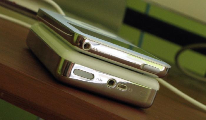
- Nice and thin. About half the size of my old iPod.
- All metal enclosure. Feels solid and well built.
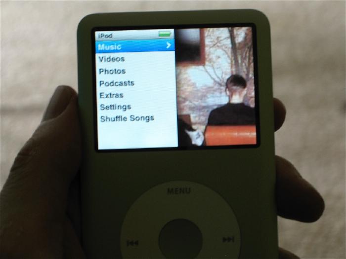
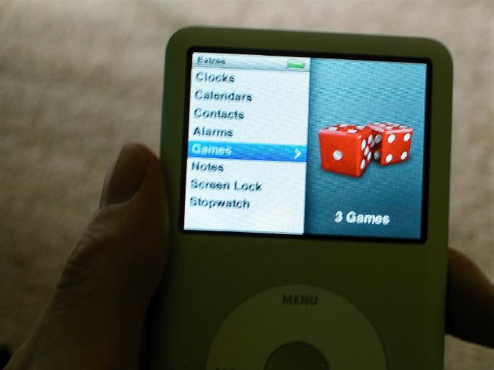
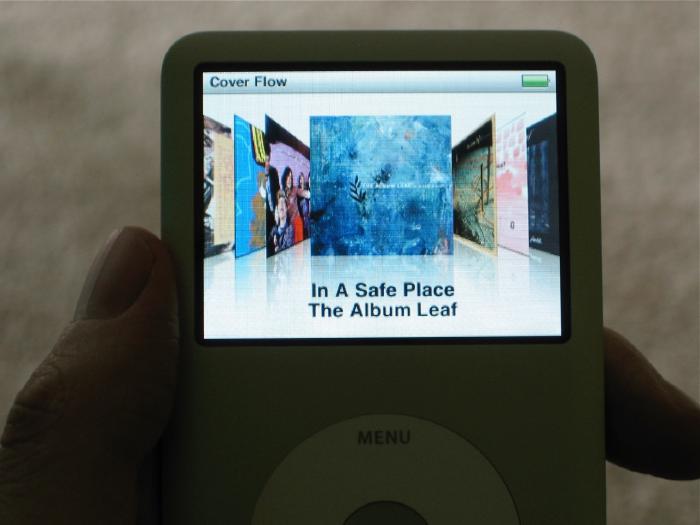
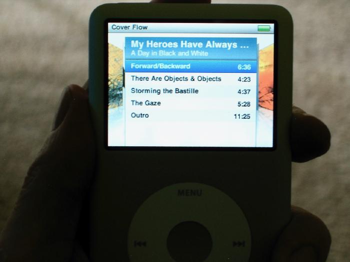
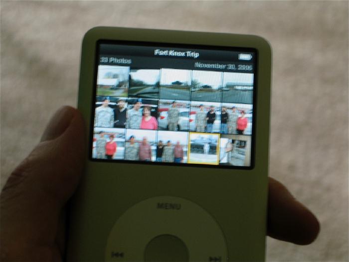
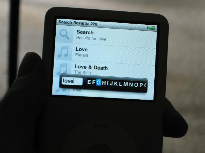
- New interface. Splitting the menu in half and showing album art and photos fade by looks great. There was so much dead space with the old interface that this is a step in the right direction.
The cons
- The interface. Sure it has eye candy like cover flow and the new menu UI, but it’s way too sluggish. When you move from music to photos to videos to settings, the menu just chugs along and you have to wait while it pre-fetches artwork. It’s not a problem once you get into playing some music but half the time I thought I didn’t press the button because you get no feedback that you actually selected something.
- The clock. WTF?!? After 20 seconds of inactivity the Now Playing screen goes away and you get this lame clock displaying the time and battery level. The only way I’ve been able to get rid of this “feature” is by turning the back light setting to Always On. Must be some energy saving feature Apple thought was necessary. Give me the option to turn this off please.
- Scroll wheel sensitivity seems off. Maybe I’m used to pre-click wheel iPod, but I have problems rating songs or moving through the menus accurately.
- Screen glare. When used in my car during the day I can barely see the screen. Not that big of a deal, but I’m glad I didn’t get an iPod touch for this very reason. Would have been nearly impossible to navigate through songs since it has no hard buttons and I wouldn’t be able to see the screen.