The iPhone is great, but the Palm Pre is more my style
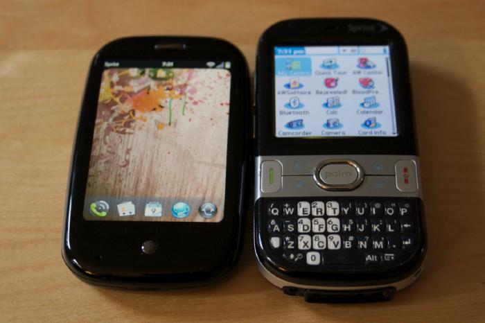
Three days later I’m still impressed with the Palm Pre. As a user of Palm OS smartphones (Treo 600, Treo 650, Centro), I’ve come to rely on a proven feature set.
The experience of having a device that organizes your life, makes phone calls, and connects online — has remained unchanged. For the most part the Palm Pre meets or exceeds my expectations, with only a few minor back steps. After the break is a full rundown of my Palm Pre likes and dislikes (mostly software related), in no particular order.
Palm Pre positives
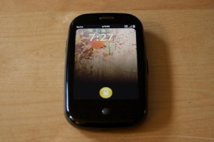
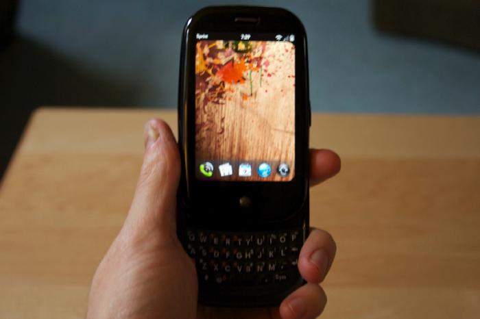
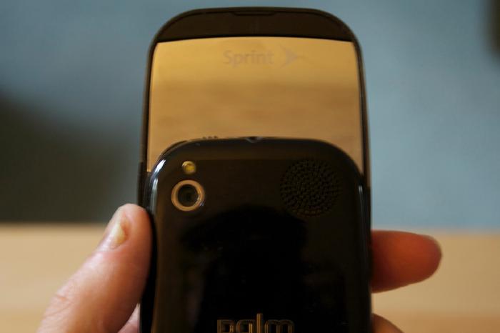
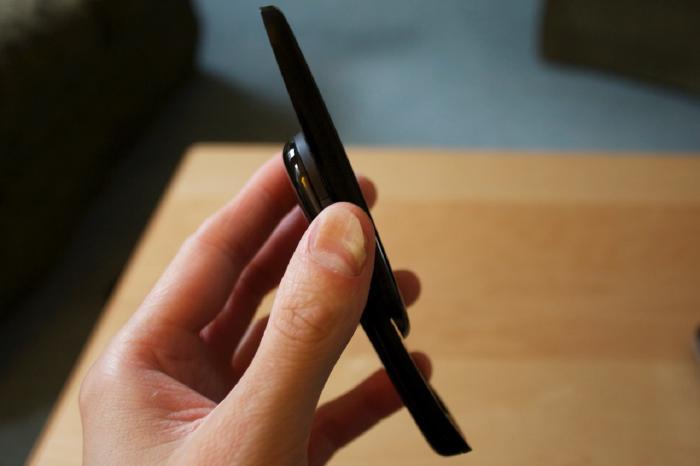
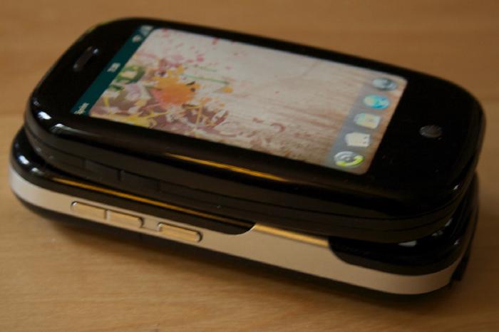
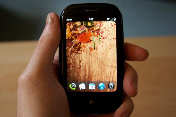
- Device feels great in your hands. (Not sure where all the “it feels cheap” reviews came from.)
- Screen looks awesome!
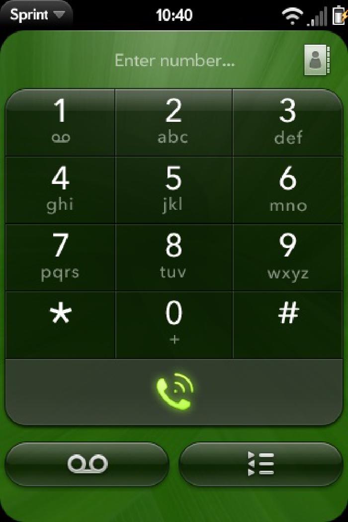
- The UI is slick.
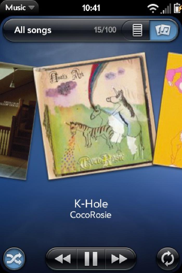
- webOS is responsive and allows true multitasking.
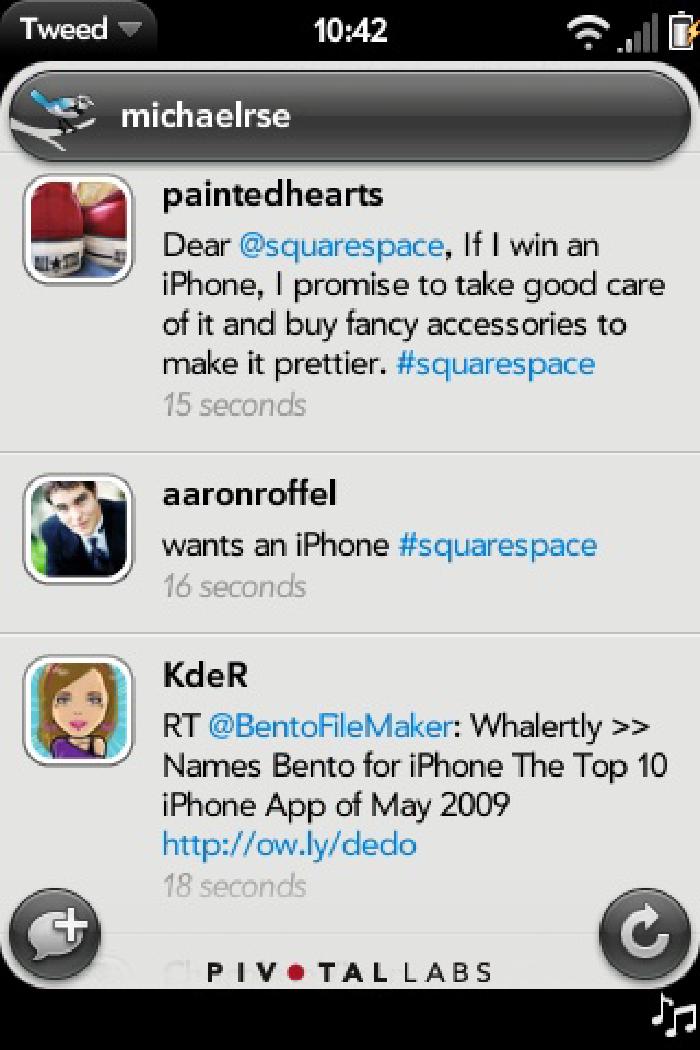
- Notifications are handled elegantly.
- Push Gmail. (Emails hit my Palm Pre before my desktop — sweet!)
- Synergy and the way that it syncs with “the cloud.” (ie: Google, Facebook, etc)
- Battery life. (I can easily make it through a workday which is all I had hoped for)
- Removable battery.
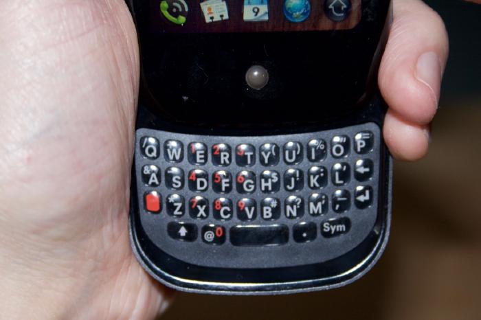
- Physical keyboard. (Yes it’s small, but coming from a Centro I have no problems banging out txts or emails.)
- Plugging in via USB let’s you access the ringtone and wallpaper folders, to add your own to the device.
- Is capable of syncing with iTunes to add music, podcasts, videos, movies, or photos.
- Backups every day to your Palm Profile — in case you need to restore your device after a wipe.
- GPS and Sprint Navigation for turn by turn directions.
Palm Pre negatives
- Having to pay $30 for the Classic app. Booooooooo!
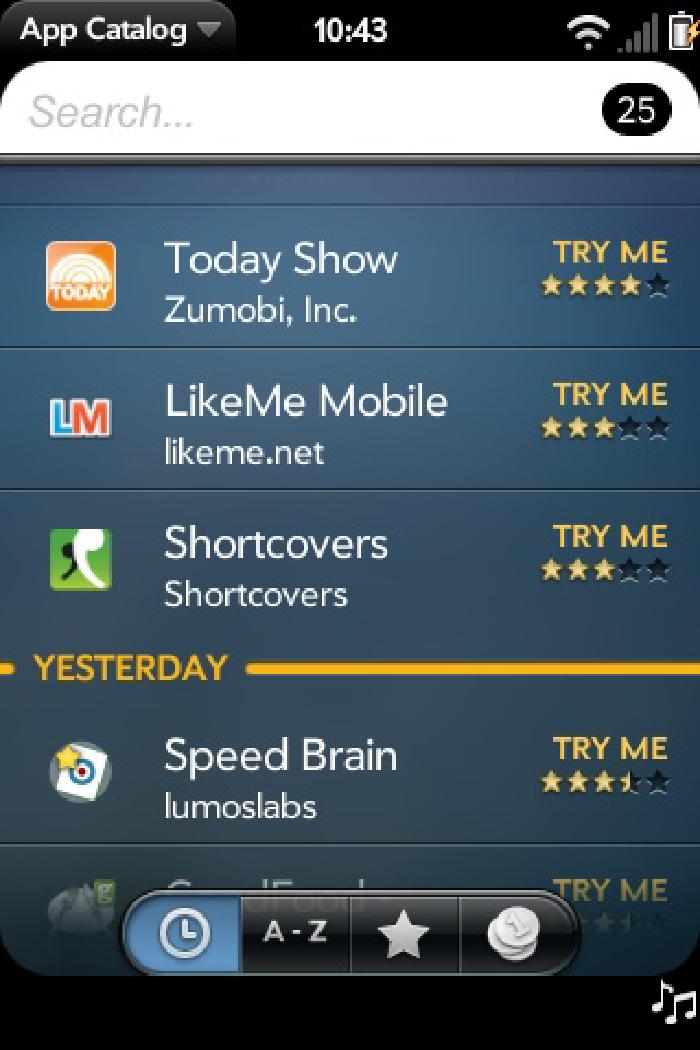
- Having to use Classic at all! Let’s get true webOS versions on the App Catalog so I can stop using Classic for a few archaic applications.
- No option to make Tasks repeatable like the Palm OS version. (Maybe I’m the only one who relies on this — I dunno)
- Tasks don’t sync up with Google Tasks. (I’m sure this will happen eventually)
- Flipping through the Calendar is slow.
- No agenda view in Calendar.
- Sprint Navigation doesn’t pull in your contacts’ addresses if they’re coming from Google or Facebook accounts.
- Can’t change the notification sound. (I have no desire to change it but it would be nice to have the option)
- Can’t assign a default ringtone for unknown callers like in Palm OS devices.
- Reception issues. (I’ve never had more than 2 bars at my house with the Centro, but the Palm Pre seems to average much less and I’ve experienced a few dropped calls)
- Landscape mode is limited to a few applications
- USB port cover seems cheaply made and I feel like I’m going to break it off every time I open it.
- Device does get warm after prolonged usage. (To be fair so did my Centro)
- Audio speaker isn’t that loud.
So there you have it. Can’t say that I was excited about the thought of paying an extra $20 a month for the required Sprint Everything Data plan. But seeing how I’m getting more anytime minutes, Sprint Navigation, Sprint TV, and nights that start at 7pm instead of 9pm — I’ll live. My only real Palm Pre complaints stem from its software or lack of applications, which I’m pretty confident will be addressed with future firmware and software updates. I hope.
If you’re looking for a more in-depth look at the Palm Pre, check out Precentral’s extensive review. They cover every aspect of the phone with a detailed write-up, photos, and video walk-through.
