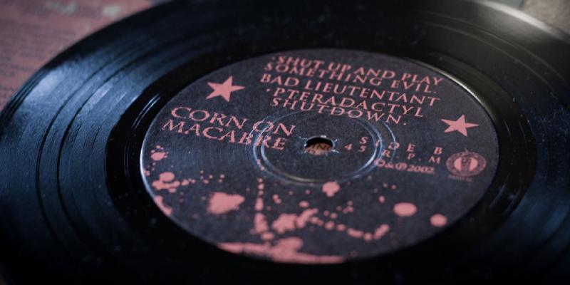
Corn On Macabre record art — vellum and metallic ink bliss
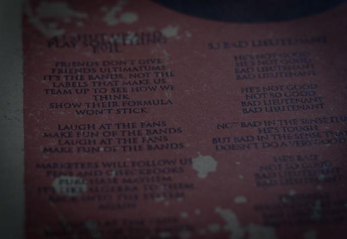
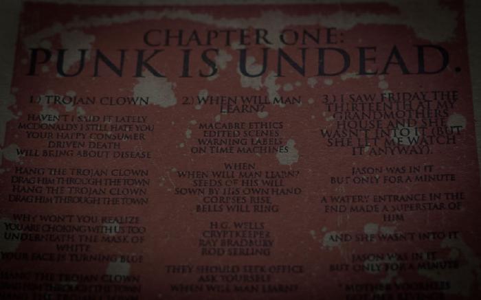
My favorite thing about this Corn On Macabre record has nothing to do with the band or the music. Sense of sight and touch often influence me more than sounds…
The medium is important
An often overlooked aspect in design are the materials chosen to help communicate the message(s). The paper printed on and the ink printed with, can completely screw with a design if they’re speaking different languages.
If the sleeve art for this Corn On Macabre 7-inch was printed on Classic Columns or some piece of bright white the tone would be at odds with the music. I think more of sludge, dirt, and faded photographs when listening to Chapter One. Song titles and lyrics about horror movies don’t exactly benefit being printed on glossy card-stock, know what I mean?
Liner notes and metallic ink
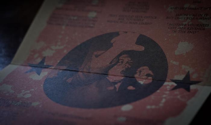
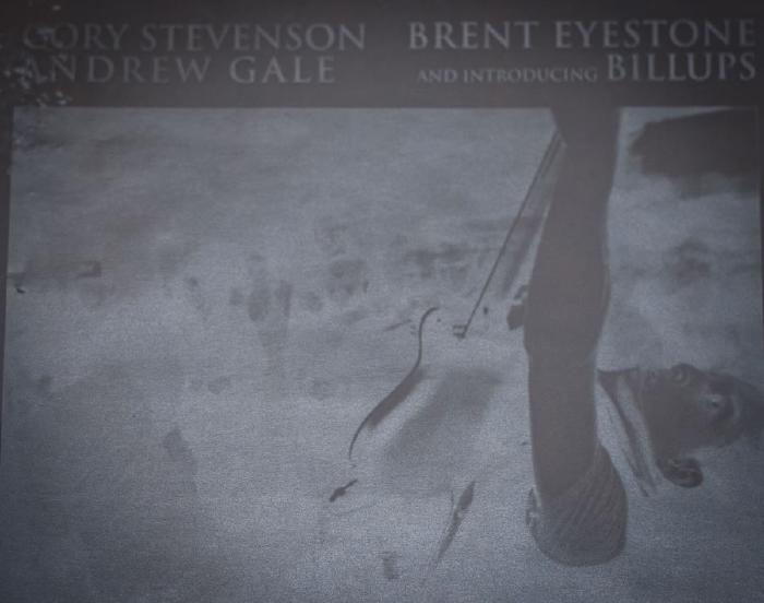
Not sure how much it added to the production cost, but I sure like the way vellum looks and feels. The translucency of the paper looks even better when these photographs are printed on it with a metallic ink. If I remember correctly, I think Brent Eyestone’s earlier band Waifle printed on vellum in one of their full length releases.
Record packaging detail images

Apparently my asshole cat shares a taste for vellum too. Maybe it was the smell, or maybe it was the way the sun caught the metallic ink, but he sure couldn’t help himself from biting into it — bastard. So much for selling this Corn On Macabre record in mint condition.
