Urban Outfitters, ya typography dun goofed again
Glad to see improvements in the May 2011 Urban Outfitters catalog. Especially since I took a few issues with the typography and other design choices last month.
A step in the right direction
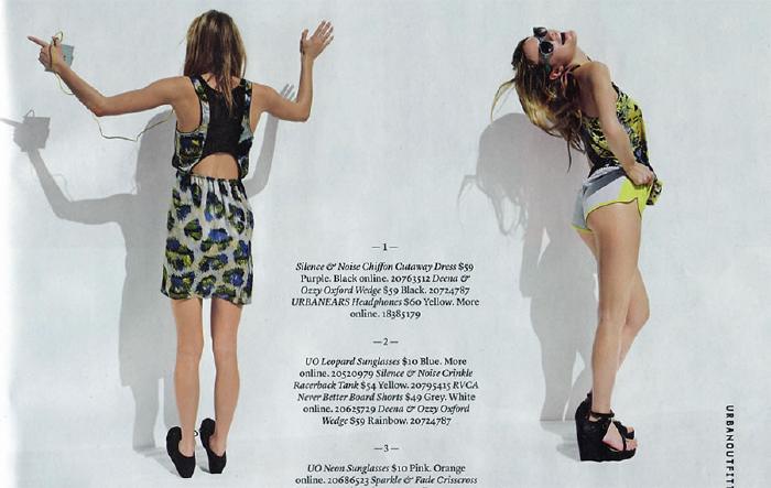
I was shocked to see product copy that was almost legible and set in a serif typeface instead of a sans (P22 Underground). Plus they even made a half effort to number blocks of text with corresponding photographs on the page (see below for example). Although it would have been nice if they actually captioned the photographs so I don’t have to think as much.

How to ruin good photography with bad typography
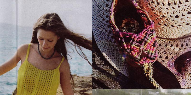
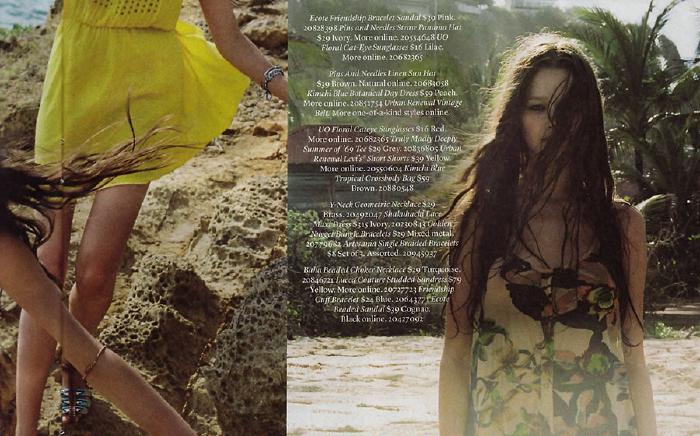
Sullied by page spreads that are obviously more interested in making beautiful pictures than helping customers make informed buying decisions.

I’ve tired trying to discover any sort of detail on the clothing and product sold in this catalog. I mean how could I? You basically need a magnifying glass and more patience I’m willing to waste trying to sort out what price and item number goes with each photograph.

Tags: Design