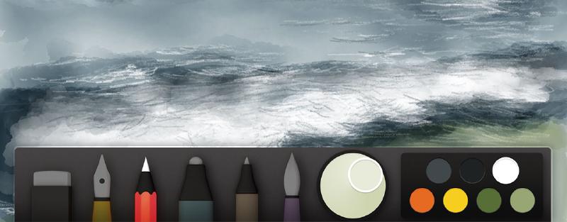
Drawing water with Paper
Hopefully the previous tutorials in my Mastering Paper guide demonstrated how easy drawing trees and skies on an iPad can be. Building on those techniques, I’m going to walk you through my process of drawing water and waves — perfect for beach and coastline illustrations!
If you enjoyed how I draw clouds, the following should be familiar territory since I use similar techniques. Let’s get started…
Mixing the water
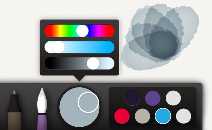
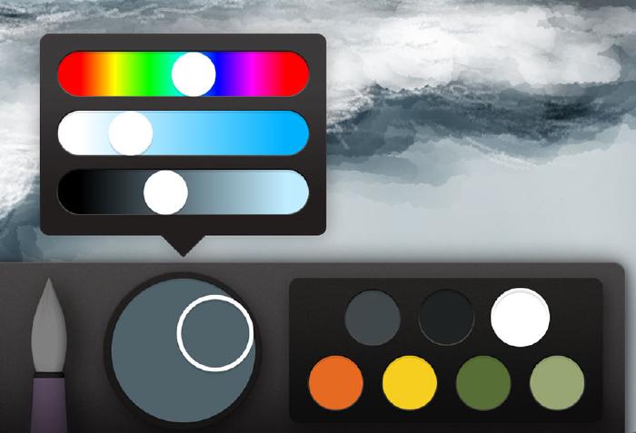
When choosing a color for the water, I like to mix it dull and gray by knocking the saturation down1. I find this helps arrive at a better base color and contrasts nicely against a bright blue sky. But don’t let this mix limit your creative vision, make it any color you want.
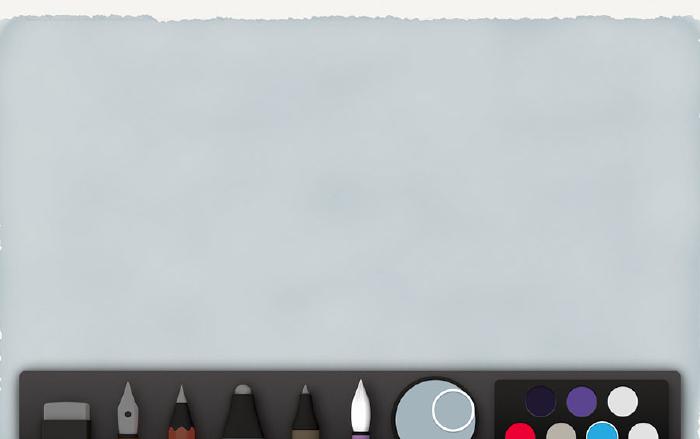
Much like drawing skies, you can choose to mark a horizon line in pencil to act as a guide — or go commando if you’re confident in your watercolor skills. If you decide to draw the horizon, remember to keep it light so it doesn’t bleed through the watercolor we’ll be applying next.
Base coat for the water
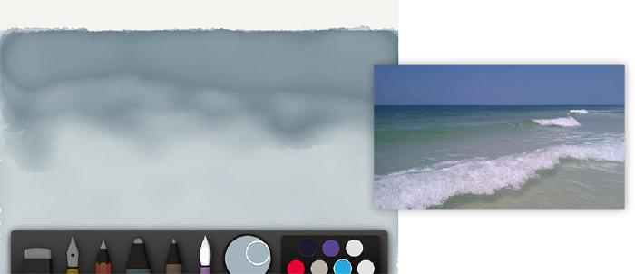
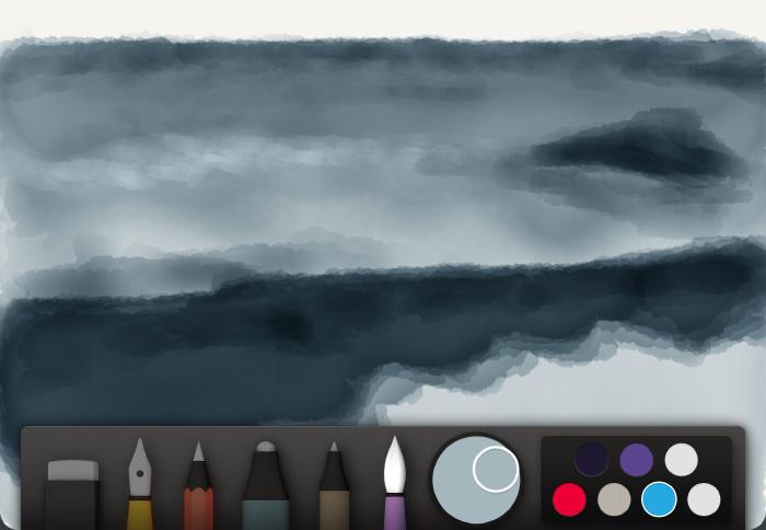
With our blue-gray mixed and ready, select the watercolor brush and paint a slow and even stroke to make up this first layer of water. Just like painting skies, you’re trying for an even application of watercolor without lifting your stylus or finger off the iPad’s screen. Work your stroke from top to bottom, left to right, overlapping the previously painted portion slightly. A slow stroke with a slight zig zag to it will aid in painting an even and homogeneous tone quickly.
Start with 2–3 even coats filling in the water with as smooth a tone as you can. Depending on how many wave troughs there will be, you may have to gradually fade the tone as you move down. The water I’m painting in this example is fairly flat, so keeping the tone smooth throughout is the goal here.
Adding wave chop
For the sake of this tutorial I’m going to draw small waves using quick and choppy watercolor brush strokes. The technique is very similar to painting clouds using white, only in this case we’re using the same color we painted the water’s base with. The waves I’m painting are fairly flat so there’s no need to go overboard with the chop.


Under painting large waves
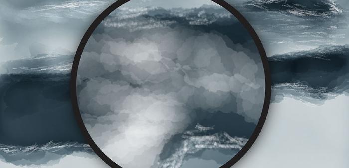
Depending on the intensity of the waves this next step can be omitted. For larger waves with a lot of white foam, I like to paint a few more layers of blue anywhere these waves appear. The more layers, the darker the blue — the darker the blue, the higher the contrast there will be between the white wave foam we’ll be adding next…
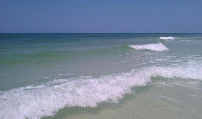
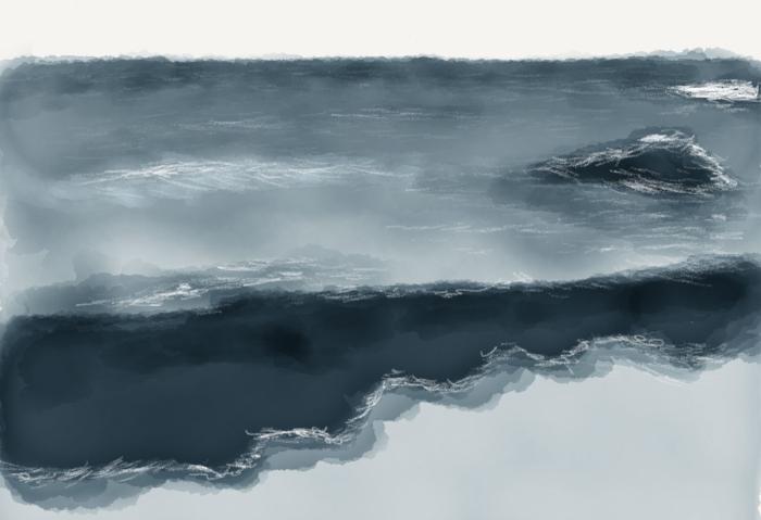
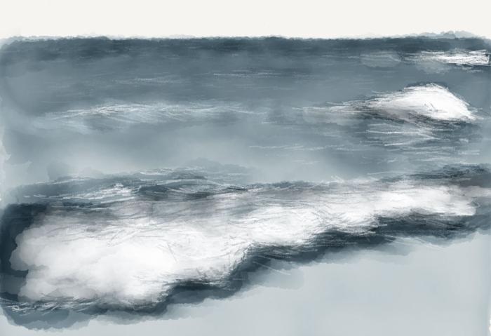
Using this photograph as reference, look for the large white areas of a wave and “underpaint2” there.
Waves, it’s in the details
With a solid foundation set, it’s time to add the finishing spit and polish to our waves. Select the pencil tool and fill it with the same blue we used to base coat the water. It doesn’t have to be an exact match if you didn’t save the color in your palette, just something close is all that’s needed.
Starting at the top of the water lightly sketch strokes from left to right. The severity of each wave will determine the direction and angle of these pencil lines — the larger the wave, the greater the angle.
A Pogo Connect Smart Pen works great for this step. It allows you to draw lightly and avoid going too heavy in an area. If you’re finger painting or using a normal capacitive stylus, remember to move quickly with your pencil strokes — the quicker you draw the lighter the mark.
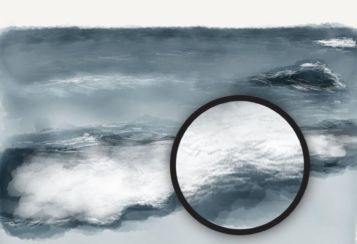
White wave crests and foam
Crests or areas where waves might be crashing against land I go heavy with a white pencil and try to make it textured and scratchy. Criss-crossing or hatching my strokes is one way of doing this quickly. If you remember my guide on painting clouds, the technique is the same.
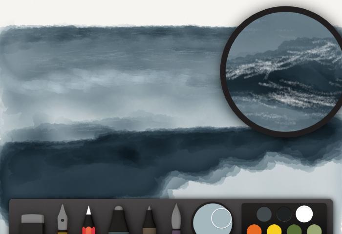
Draw wave crests and foam using a white pencil.
Depending on the size of the wave crests it’s usually easier to lightly paint in some highlights using a watercolor brush filled with white. Quickly dabbing or painting in short circular bursts will allow you to gradually lighten an area, without destroying the blue base coat beneath.
Dabs of white can cover an area much faster than the pencil tool when filling in large shapes.
Adding shadows to the waves
To add in shadows use a variation of the water’s base color, mixed with 20–40% black. Apply the same technique used above but with this darker color instead of white. Focus on putting a few pencil strokes of dark adjacent to the white strokes which will add depth to the waves. As always, if you over work an area just rewind or draw over it using white if it’s a shadow, and a shadow color if it’s white.
A pencil mixed with a dark blue-gray is perfect for refining edges and adding definition to smaller waves.
Boom! And we’re done. Combined with a blue sky from my previous guide and you’ll have a landscape that looks like you drew it with traditional art supplies. Shhhhh…your secret is safe with me.
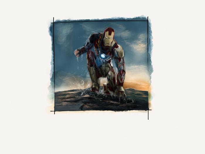
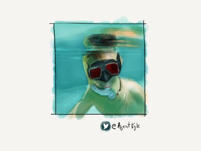
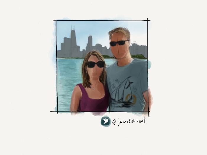
Variations on a theme
Using all of these techniques I was able to create a variety of backdrops for the portraits in my PaperFaces Project. Below are finished waterscapes to show what is possible by varying the color and composition.
The next part will include techniques for drawing various textures with Paper’s tools. Things like wood grain, brick, asphalt, and concrete will all be covered to round out the landscape portion of this guide.
In Part 1 of my Mastering Paper Guide I explain how to use the color mixer and what the various sliders mean and do. ↩︎
Underpainting is an initial layer of paint applied to a ground, which serves as a base for subsequent layers of paint. ↩︎
6 comments
Thanks you again, Michael. This is invaluable!
Thanx for spending your time on this, it’s informative and good fun to have a go at!
Wanted to add my thanks, too! What great resource for the community! Looking forward seeing you continue to expand on the great work you’ve already done.
great tutorials. i never thought i could use paper this efficient
Thank you for the great tutorials. I really appreciate you taking the time to teach.