Knowing grids means breaking grids
Of all the things to grab my attention, the grid system used in a women’s health calendar was certainly not high on my list.
It’s a funny story that will probably make less sense after I describe this awful analogy, but here it goes. You ever do something for so long that you start seeing it creep up in random places? Back in 1997, after I got a Nintendo 64 and played Super Mario all night instead of working on my 3D design projects. I started getting these crazy ideas that I could triple jump over ponds or reach the top of buildings by doing a back flip like that mustachioed plumber.
Sitting in 2D design and typography classes for 4 years of my life had a similar effect. It was like having a magician expose all his secrets to me. Problem is, I can no longer take these tricks at face value and instead see grid systems, slight of hand, and other illusions played on the eye. Guess that’s become both a curse and a blessing…
So what does all this nonsense have to do with a women’s health calendar? Glad you asked because I was about a whole half seconds away from losing focus.
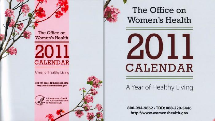
Three columns two typefaces
There is absolutely nothing about this cover that I don’t like. It’s been sitting on a chair in our dinning room for the past month and I always catch myself eye-ing it up. Shhh… don’t tell my wife.
The two punch knockout for me is the combination of serif headlines followed by sans-serif subheads. Whoever designed this made sure they didn’t use some bunk freebie font because the ff ligature looks damn good in “office. A+.
Interior spreads
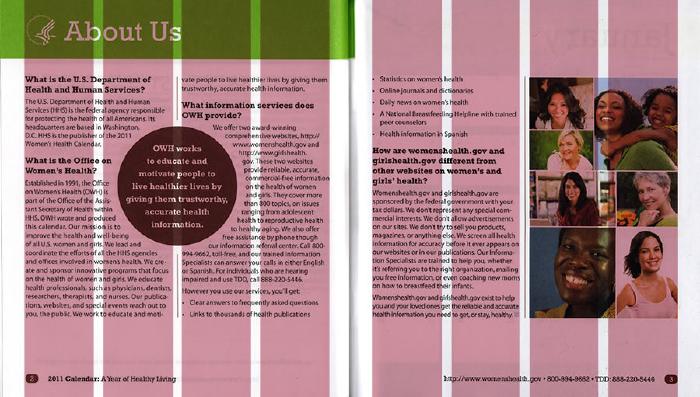
Contrasting with the cover’s wide 3 column grid, the interior pages opt for an even 4. While most pages keep a two column layout, the 4 grid system allows for plenty of variation to accommodate the calendar pages. It keeps a consistent measure in the column spaces and gutters as well, helping to create a nice mathematically derived horizontal rhythm.
Imagery on the right page does two things — adds interest to a text heavy page, but more importantly it draws your eye back in because all of the faces are looking left. When holding the printed piece in hand, the smiling people become one of the first things seen when flipping pages. It immediately pulls you in and helps your eye orientate left to begin reading.
Something I’ve been trying to do more of with my print grids, is adhering to a strict vertical rhythm. For the most part the OWH 2011 Calendar achieves this, but could use some minor line-height and spacing adjustments to align all baselines. So much easier to do in print than on the web unless you enjoy the maths.
Getting obvious with fine details
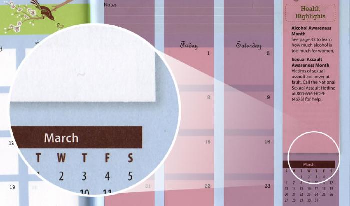
I often have a problem with adding to much complexity to a design as a way to give it depth. It’s refreshing to see such a modern and minimal approach in this piece. A minor detail I’m willing to bet non-designers never noticed was the thought put into border shapes and frames. In each of the health problems’ icons, the bottom corner is formed at a perfect 90 degree angle instead of rounded. This contrast in shape creates an arrow that helps direct you down to the next line of text.
If I’ve learned anything as a designer, it’s to make more insightful moves with my grid and other invisible elements. Hopeful this will let the content of each design do the communicating and draw attention. That’s really the point of all this — isn’t it?

Fine and subdued imagery catches my eye?

Taking the time to develop a strong grid system helps bring order to placing type and image.

Nothing irks me more than when drop shadows are applied with default Photoshop layer styles. Glad to see someone dialing back the opacity and blur for a subtle way of adding dimension.
![]()
A straight corner is just asking to stand out amongst the rounded and direct eye traffic to a logically spot.
Tags: Design