Typography no nos with Urban Outfitters
I think it is very clear that the April 2011 Urban Outfitters catalog was more concerned with style and art direction than typography. Now, I’m not trying to weigh the implications of, or reasons for this. Being a designer who values legibility and hierarchy, this catalog sure is filled with a bunch of head scratching typographic choices.
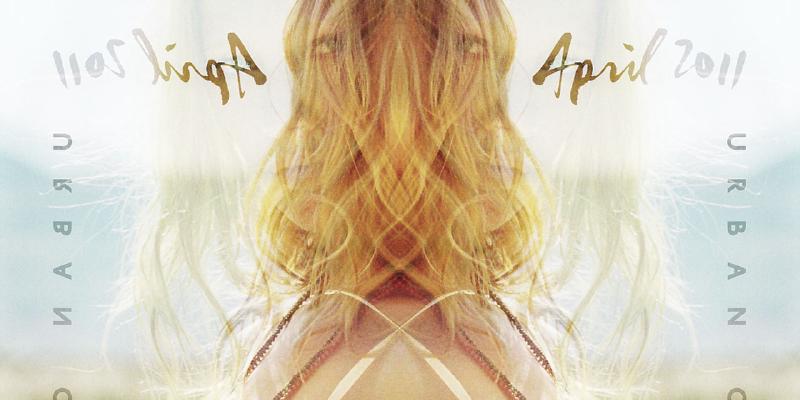
Would it have hurt to move these blocks of type to right a few inches?
Violators, mount up
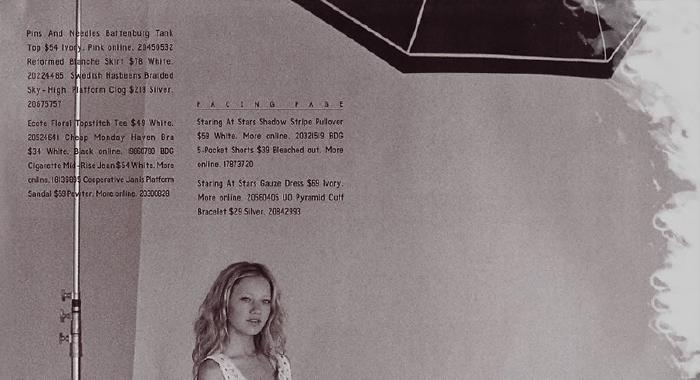
Inside front cover starts off with this gem. I absolutely hate when an element in the background violates a block of type in the foreground. Now sometimes this can serve a purpose, but here I can’t fathom one single reason why you’d place a paragraph on top of a light stand or whatever the hell that is. I just can’t help wanting to move both paragraphs to the right three inches and neatly tuck them under the protruding umbrella…
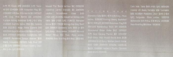
I hate full justified type
Ok cool, moving on. Pet peeve number 2. Well really this should be numero uno, but seeing how it wasn’t the first offense I noticed, I’ll cut it some slack. But honestly, I don’t get the point of fully justified type. Pretty sure this isn’t a newspaper, magazine, or periodical that’s so tight on space that it actually makes sense to squeeze in a few extra characters this way.
I’m probably wrong and this isn’t suppose to be a catalog. What would be the point of making the product description readable? Or why would you want to clearly define item SKUs and prices so someone could actually find them and place an order? Lines running into each other without any breaks, hierarchy, or logic always seem to make a ton of design sense. Ugh.
Oh never mind. At Least one page out of 48 must have read Ellen Lupton’s Thinking with Type. Away with fully justified type and in with a lovely rag on the right. And would you look at this, size, weight, and placement changes to help lead you from section to section. I might actually be able to figure out what descriptions go with each piece of clothing. Now if I could only tell if that’s a 1 or a capital i.
Typography rulez
Kidding aside. I’ve always enjoyed Urban Outfitters fresh ideas even if they break a few rules along the way. They never get locked into using the same typefaces, mastheads, logos, photography, paper stock, etc. About the only thing consistent is the inconsistency of each season’s catalog — a trend that follows through on their website. And for something so closely tied to fashion that’s probably a smart move.
At the end of the day I really doubt any one is looking at these pages wondering why the kerning is off. They’re most likely thinking, “damn this hipster bullshit is overpriced” or why aren’t any of these ladies wearing pants?
Readability no nos
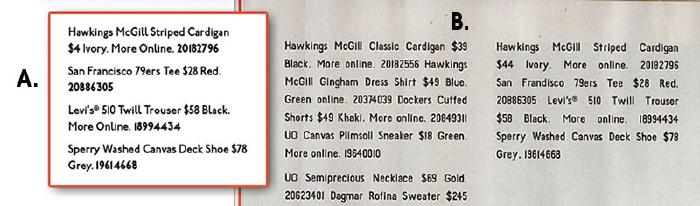
Just for giggles I mocked up a type treatment with left justified type and varying font weights. Which one do you think is easier to read? A or B.
White type on a light gray background is awful for readability.
This page isn’t half bad. No justified type, nice rag, and solid use of a grid. A++, would read again.
Made Mistakes is a participant in the Amazon Services LLC Associates Program, an affiliate advertising program designed to provide a means to earn fees when linking to Amazon.com and affiliated sites. For full details read the complete disclosure policy.
Tags: Design