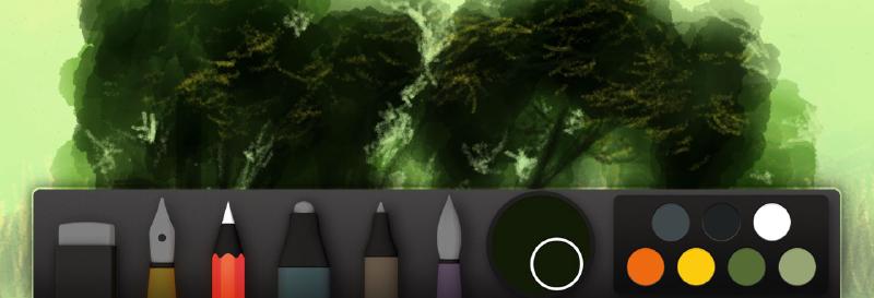
Drawing trees and grass with Paper
Sorry for the delay in publishing the next installment of my Mastering Paper Guide — between the twins and my day job, I’ve had my hands full this summer. But enough of all the excuses, let’s get right into it OK?
Drawing trees
When I draw trees I select the watercolor brush and jump right in, using one continuous stroke to rough out a general shape. Don’t worry about being precise here, we’ll refine the edges later. You could start with a light pencil sketch to nail your the composition, but I usually don’t — it keeps the tree feeling organic and less rigid (a happy accident is your friend).
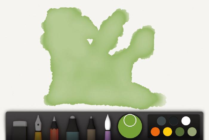
Building up a color with multiple layers usually yields better results than one dark glaze.
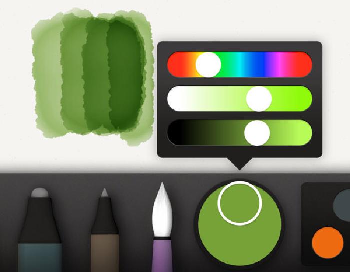
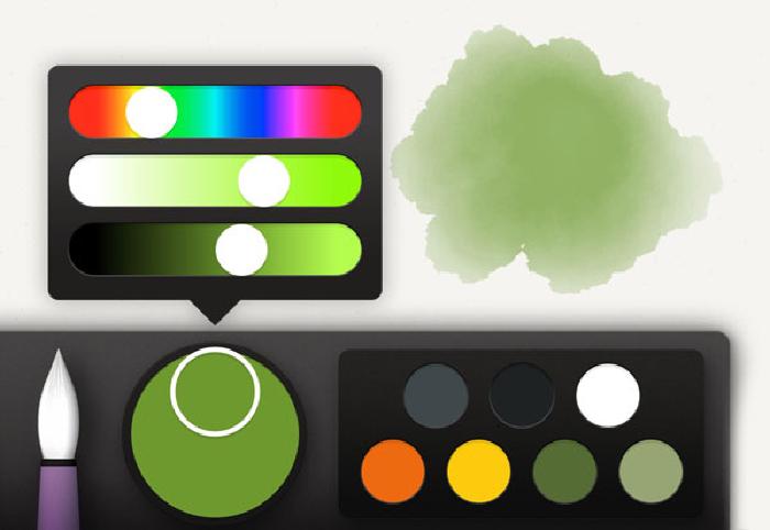
Here are some of my favorite colors to get you started painting leaves:
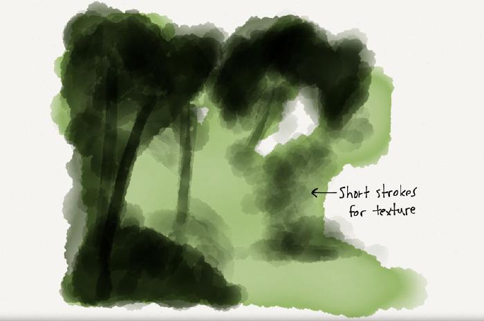
Once you’re happy with the general shape of the tree, it’s time to add some shadows. You can continue to use the same base color from before or darken it up depending on how much shadow you have to color. What I like to do is make short strokes to create a blotchy texture. For you traditional painters out there, it’s kind of like scumbling, only we’re not scraping paint around with a dry brush.
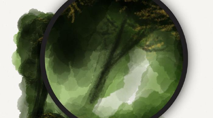
The primary goal here is to give the illusion of leaf clusters and indicate where the branches and trunk flow. FiftyThree’s Pencil or a Pogo Connect Smart Pen can help immensely to paint branches of varying widths — an ability no other styli support when used with Paper by 53.
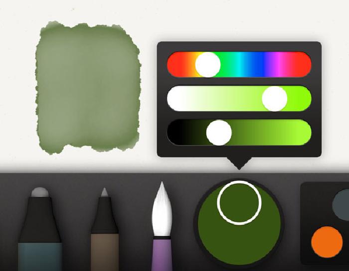
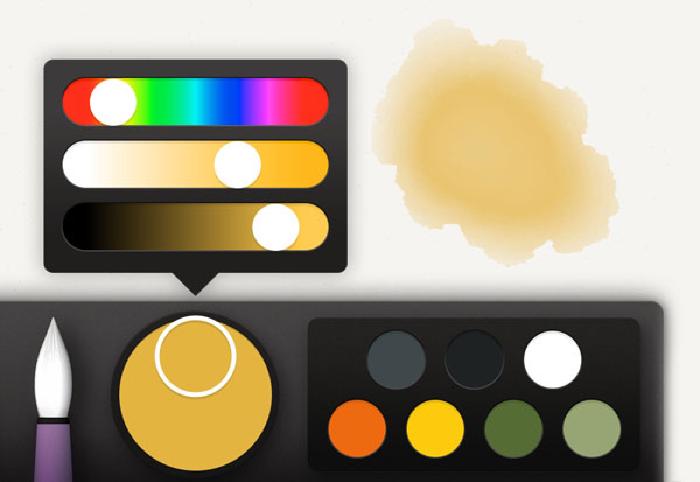
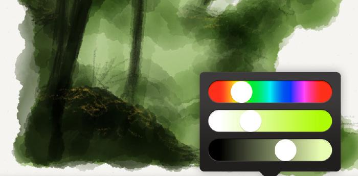
Now it’s time to start adding detail to the tree with highlights. Using a reference photo can help determine a good highlight color, but if you don’t have one check below for my favorite mixes. Stay away from colors that are too white — you want a color that is still in the family of your base color, just warmed and lightened.
With our highlight color mixed, select the pencil tool and start lightly sketching small “scratchy” marks over the base coat. The more times you go over a pencil stroke, the more intense the color will get. Try not to overwork one area with the pencil, the key is to keep everything harmonious.
At this point your tree is pretty much done — it really depends on how much detail you think it needs. If this tree is the primary subject of your composition then you probably want to work it some more and sharpen the edges. If it’s just background filler I’d suggest keeping it soft and blurry so it doesn’t compete with whatever you’re placing in the foreground.
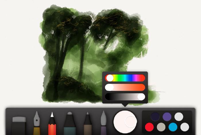
For extra detail grab the base green from before, and mix in some brown and black, for a nice dark color. Armed with a pencil, use this color to add branches, and refine edges. If you overworked areas with highlights earlier, this darker color is perfect for adding shadows back in.
To finish, quick strokes of watercolor with either a light gray or light dull green, can be used to add subtle gradations. Don’t go crazy here, a few small strokes on top of the pencil marks is enough to add depth.
Grass and foliage
When drawing grass, bushes, and other greenery, the same tree techniques can be applied — with some slight variations.
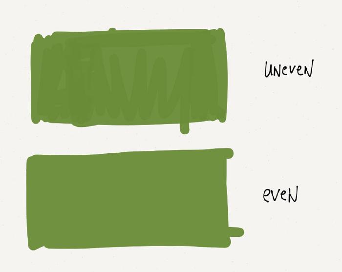
Instead of painting a base coat with watercolor, I like to use the marker or fountain pen. If done in one stroke (without lifting your pen or finger) you’ll get a single continuous color. Otherwise two coats will be required to make this shape smooth because of the translucent nature of these tools.
This next step can be tedious, especially if you have a lot of grass to add. To draw each shard of grass, I use green mixed with yellow (pretty much the same highlight color used for trees), and draw small strokes with the pencil. The direction and length of these strokes are important to render realistic looking grass.
Grass cut short is painless to draw. Making small subtle marks with the pencil to suggest grass is all that’s needed — texture is what’s important here.
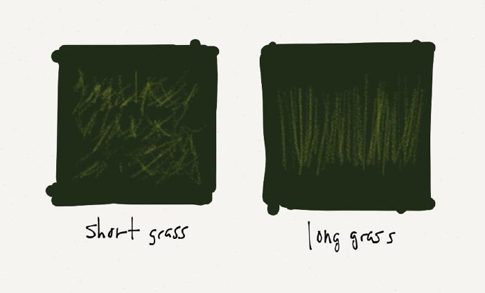
Dark green pencil strokes from the grass’s base up to the middle can be used to add shadow to longer grass. For shorter strands, well placed marks below highlight strokes will add an amount of depth.
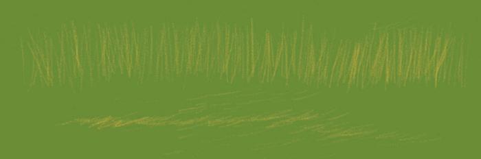
One final tip for creating depth is to paint over everything with light gray or tan colors. Grass that is furthest back receives more coats of watercolor — while grass that is in the foreground gets less.
Variations on a theme
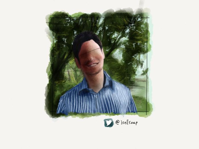
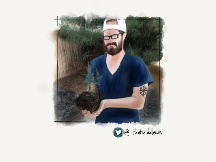
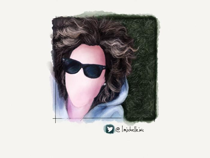
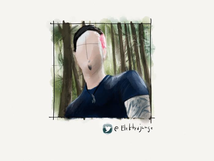
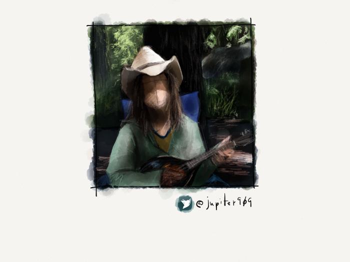
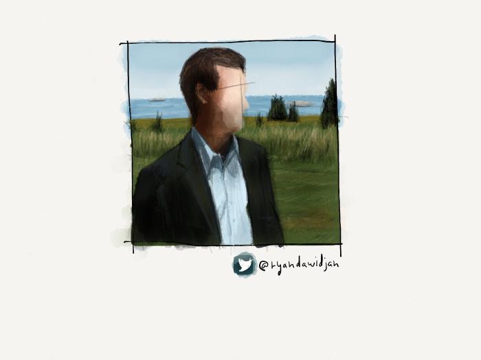
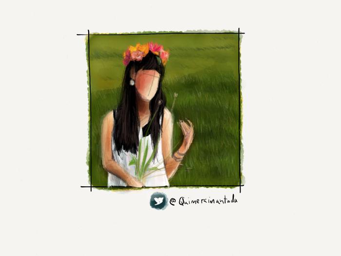
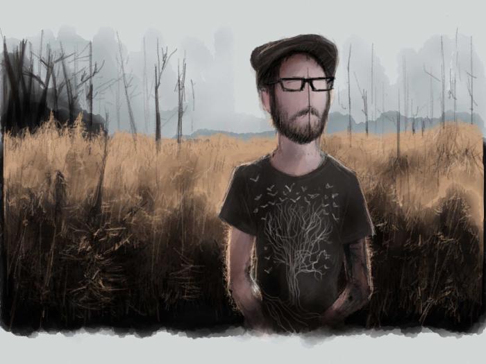
Using these techniques on their own or in concert, I was able to create lush backgrounds for many of the portraits in my PaperFaces Project. Below are a few tree and grass examples to show what is possible by varying the color and composition.
In the next article in this series I’ll take you through the techniques and steps I use to paint a blue skies, fluffy clouds, and sunsets. All three are the perfect compliments to a well drawn tree…
7 comments
Thank you for the wonderful guidance you are providing. I’ll be awaiting the next installment with the same eagerness I looked out for this one!
Excellent! Thank you for taking the time to put this guide together.
Love love this! I bought the full 53 simply because I think its an amazeballs app and a great way for me to create my own graphics for my blog. Now i just need to learn how to draw! Excited about receiving your next tutorial!
Wow. Many thanks. This is brilliant. New to Paper but I love it already. My work is in oil or oil pastel, and Paper will give me a great way to get the best composition and keep me loosened up. The step by step is a great way to get stuck in with fab results straight away. Good teacher. Cheers.
Thanks for some great tutorials. Looking forward to the next ones.
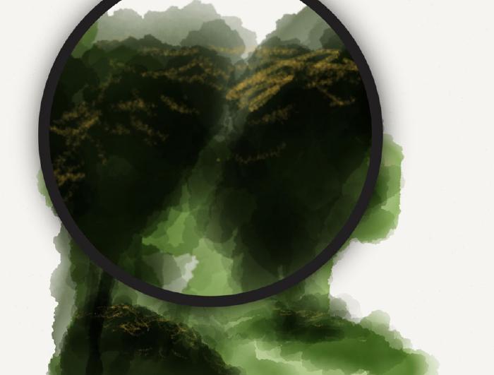
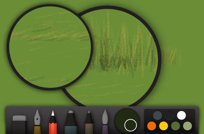
On the 4th image on the grass tutorial, you have 2 zoom loupes on the screen. Was this ever possible in paper previously ? How did you do it?
No that was never possible. Just a Photoshopped screenshot to show details.