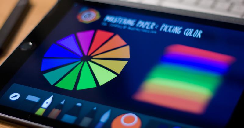
How to use Paper’s color picker
Re-imagined zoom tool, check. Expressive paint and ink tools that react to the speed and angle of your strokes, double check. A familiar color picker to sample, match, and adjust hues — triple check. Yes that’s not a typo, Paper by FiftyThree (53) finally has a color picker.
With each major update Paper takes a forward leap into maturity as new tools and features are added. You really get the feeling that everything has been weighed to carefully balance and compliment the way you interact with the app. Almost to a fault, the tools and gestures have been designed to fade away into the UI putting the focus on what matters most — the ink and paint being placed on the canvas.

From those early days of working with a constrained palette up to the addition of the Color Mixer, selecting and manipulating color has been very important to me. The lack of a color picker has been a minor annoyance for me but I really started to feel its absence after the launch of Mix. Trying to accurately match color palettes when remixing ideas became a time sink that I’m glad to see finally filled.
How to use the Color Picker
First off you need to own either the Essentials or Mixer In-App purchases to enable the Color Picker. If you have FiftyThree’s Pencil then good news, all of the tools are already unlocked for you.
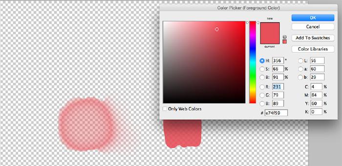
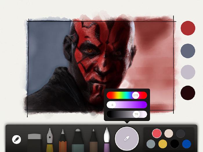
To sample a color tap on the small circle inside of the Color Mixer — you may need to tap it a second time if it wasn’t previously selected. You’ll know you’ve done it right when an eye dropper icon appears in the circle.
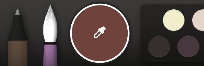
Tapping the eye dropper icon will place a small circle onto the canvas that you can use to sample colors and add to your palette. You also have the option of refining a color by moving any of the three HSB1 sliders around, but I’ll get to that in a minute.
There’s not much more to using the Color Picker. As the small circle is moved around the canvas, the color inside of it will change letting you know what color is selected. There is also a black dot in the center to help with alignment when trying to pick up a tiny speck of color.
When you’ve found a color you’d like to work with or save to your palette tap the circle. You can also tap the eye dropper icon inside of the Color Mixer or any of the tools in the tray to select the sampled color.
Picking colors from a photograph
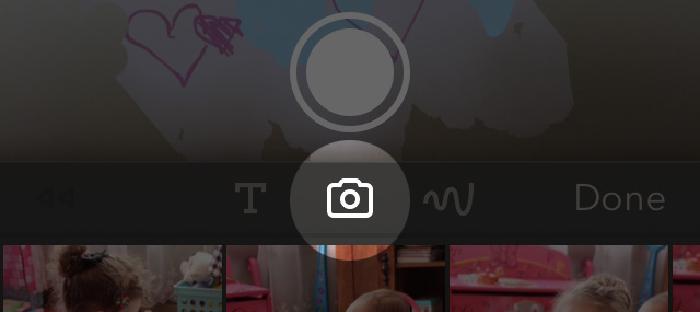
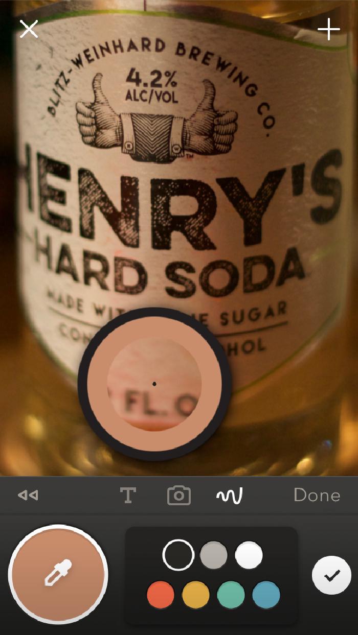
Sampling colors with the picker tool isn’t limited to just the ink, fill, and background layers — you can also sample colors from photos. To start you’ll want to import an existing image (or snap a new one with the camera).
To place a photo on the canvas tap the camera icon. Importing photos can be done when an idea is first created…

Or after the fact…
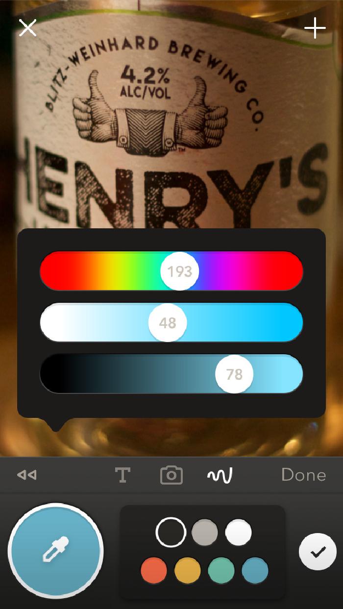
Once you have a photo on the canvas you can sample its colors same as before:
- Tap the small circle inside of the Color Mixer tool.
- Tap the eyedropper.
- Drag the selector on top of the area you wish to sample.
- Tap the eyedropper again to work with or save to your palette.
Color Picker limitations
99% of the time the Color Picker will work as you expect it when placed on top of ink, marker, and pencil strokes. But when sampling the transparent strokes made by the watercolor brush or blends, you may not get the results you were expecting.
Let’s use these two splotches of color below as an example of what I mean. On the left is a shape painted with the watercolor brush and on the right one with the marker tool — both filled with the same color.
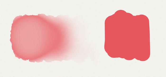
Because of the transparent nature of the watercolor brush, the painted shape on the left appears to be a lighter hue than the one on the right. You’d think that when dragging the Color Picker over both shapes it would sample them as two different colors, but that’s not quite what happens…
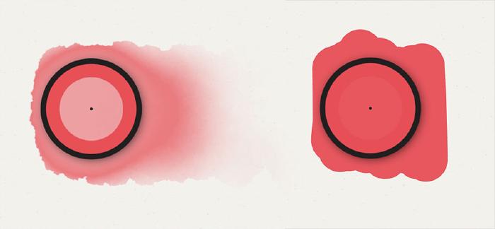
Notice anything strange? According to Paper both colors are identical even though they don’t look the same. Weird. Filling the page with a dark color had no effect on sampling.
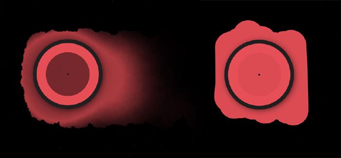
As far as I can tell the Color Picker completely ignores the background page color when sampling — rather than combining the page color with the transparent strokes on top of it. I’m not entirely sure if this is by design, some sort of bug, a limitation of the software, or a little of both. Before crying foul, sampling the colors on a transparent background in Adobe Photoshop produced the same exact results. So the picker doesn’t seem to be broken…
This little gotcha is even more pronounced when sampling areas that have been heavily blended as shown below.
Personally I think it would be less confusing if the Color Picker was sampling the combined color that you see on screen (page color + transparent strokes on top) like Procreate and other drawing apps. But like I said it’s more of an edge case scenario since you’ll mostly be sampling opaque and layered colors.
How to share colors
Don’t let that little color sampling inconsistency get you down, there’s still plenty to love about the Color Picker and enhanced Mixer tools. If it wasn’t clear from the sub-heading above, you can now sort of share colors and palettes with the Paper community.
As I’ve started to work with the picker more I’m beginning to see value in including color swatches in the margins of my drawings. It’s a way of bringing clarity to the palette I use in a piece. Not only that, but it gives me a place to stash additional colors since my 6 palettes are more than filled up.
Aside from the new picker, the Mixer received some love by now including numeric values on each of the 3 sliders. These numbers map perfectly to HSB1 values which makes communicating the exact makeup of a color others that much easier.
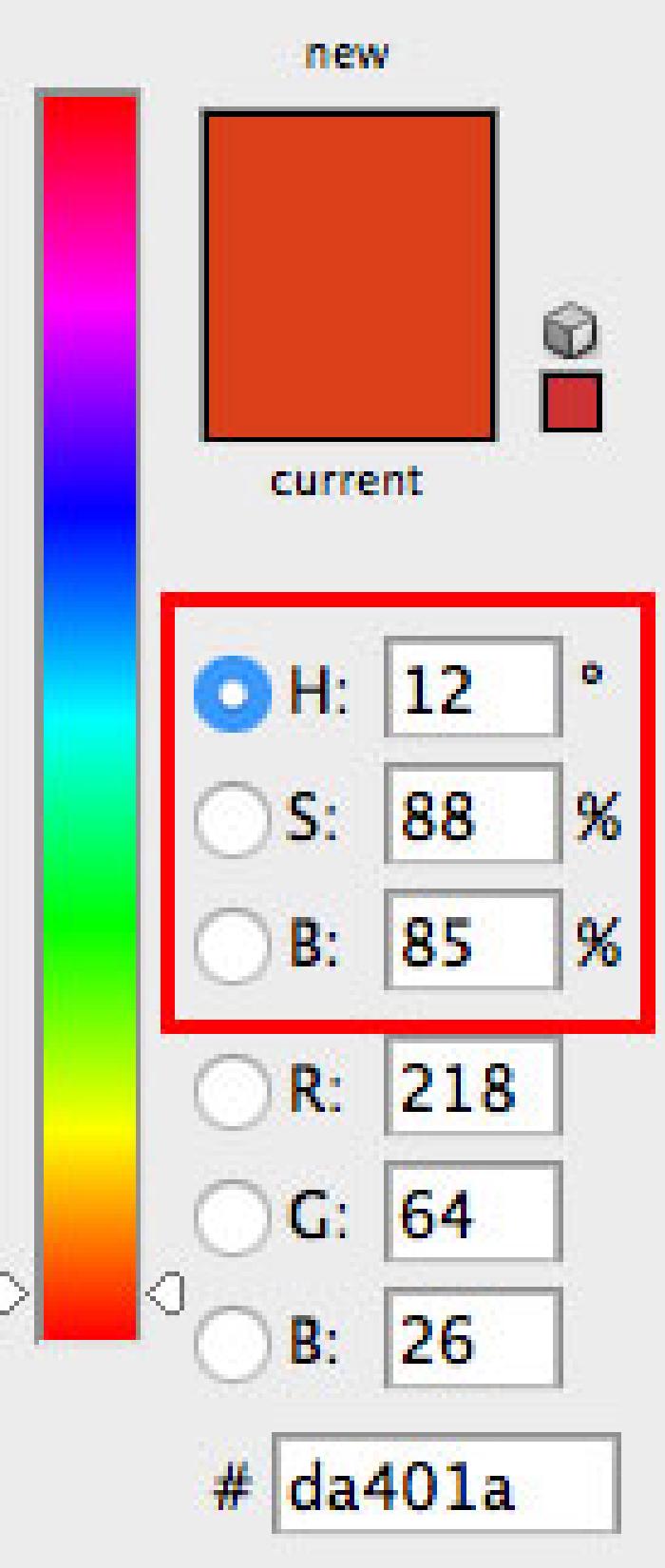
The HSB/HLS color models are available in most desktop graphics programs like Adobe’s Photoshop. By opting to include a standardized color model in Paper it is now possible to match colors across platforms and apps. As a designer I find this helpful for maintaining color consistency when importing Paper PNG files into Adobe Creative Suite documents.
Sharing color palettes on Mix
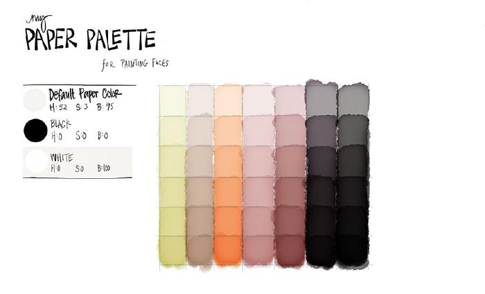
When I wrote my Mastering Paper guide for drawing portraits there wasn’t a good way for me to share my palettes with the community. Now with the help of Mix by FiftyThree I can share my palette2 of skin tones to be sampled and used by anyone who decides to download them.
What’s up next
If you found this guide helpful stay tuned for the next one where I cover how the updated page fill feature works. I was going to include it in this guide but figured it would make more sense on its own.
As always feel free to leave comments below, ask questions, or follow me on Twitter and the like (links below in the footer).
HSB stands for Hue, Saturation, and Brightness (or Luminosity). ↩︎ ↩︎
Thanks to Dayna D. Smith for providing the great “My Paper Palettes” template that I remixed. ↩︎
10 comments
Super helpful! Thank you for sharing this!
I’m just coming back to Paper and things are markedly new and different. I’m very appreciative of your explanations and I’m finding your information very helpful. I downloaded your terrific portrait palette just now and I’m wondering how I should go about importing the colors to use in my own pictures?
Do they replace the ones in the default palette or do I use the color pocket to sample them from another picture? I apologize if this is a question with an obvious answer – I’m an absolute novice with the new innovations and I’m even having trouble navigating their info docs. Thanks!"
There isn’t a quick way to import the colors. You essentially import the picture and then you sample each of the colors with the Mixer tool. Once sampled you can drag the little circle into an empty spot in your palette.
this is great, I am new to paper, can’t figure out how to download/use your portrait palette. wondering also is there a way to import brushes/templated from outside of paper?
Thank you very much. I learned something new: to pick up colors from pictures. Great!
Hi! Can you explain how to download your palette? I click on it and it just takes me to my account page in Paper to edit my settings, etc. I’m on my iPhone, if that helps. Thanks
That link doesn’t work anymore because FiftyThree did away with the Mix service that it was shared on. Only way to get the palette now is to tap and hold on the image above, save it to your camera roll, import that image into Paper, and then sample the colors from there.
I love Paper, but I can’t locate a “fill shape” function, such as the paint bucket in the old paint program on a PC. Do you know?
Paper has a fill tool if you’re a Paper Pro (or legacy Paper) user.
Thank you so much for creating this post! It’s 2019 and Paper has changed so much, but I have never worked HSB/HSL color models before and had no idea how to recreate my color palette in Illustrator. Awesome blog~