Drawing textures with Paper
Been reading my Mastering Paper series of guides? Then you already know many of my Paper app techniques1 and tricks for digitally painting scenes of nature.
Like how to draw trees, leaves, bushes, grass, skies, clouds, water, beaches, and waves — all the building blocks of a solid landscape composition. With this tutorial I’m going expand into more objects with a focus on how to draw and paint specific textures digitally.
If you want to learn how I draw bricks, wood grain, concrete patterns, rocks, and pebbles on an iPad using the app Paper, read on.
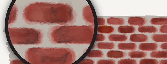
How to draw bricks
Bricks can be a monotonous subject to draw because of all the repetitive shapes. Getting the perspective right can also be challenging when trying to draw a brick road or wall that isn’t flat or viewed head on.
I’m not going to try and explain perspective or how to set a vanishing point because it’s beyond the scope of this guide.
To start I like to sketch lightly with Paper’s pencil tool to create guidelines to paint around. An easy way to do this is follow along where the cement is between the bricks and sketch your lines there.
A photo reference is a big help here…
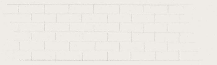
Sketching guidelines
The pencil color used doesn’t really matter, just make it something light (a gray perhaps) so it’s easier to cover up later.
A smart stylus like the Pogo Connect comes in handy allowing you to produce lighter lines by gently applying pressure as you draw — similar to a real pencil.
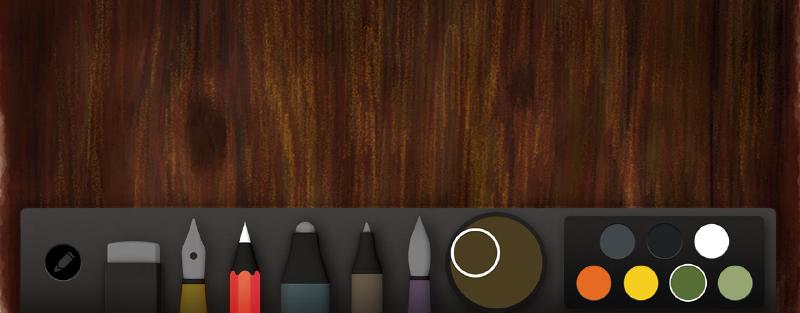
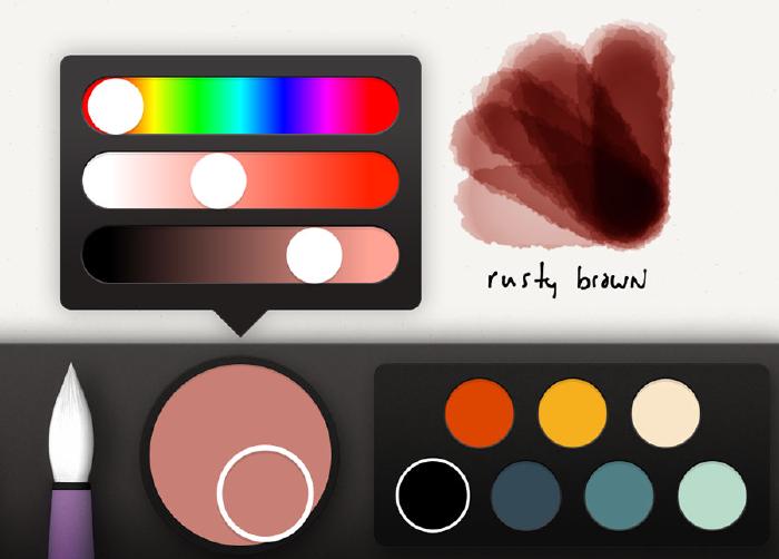
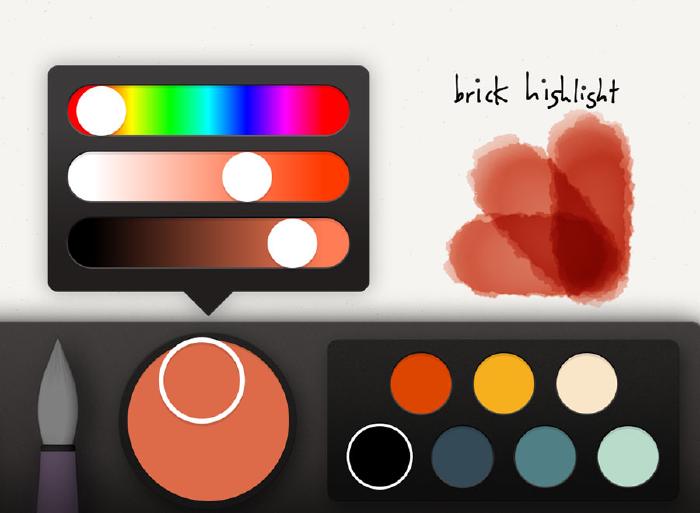
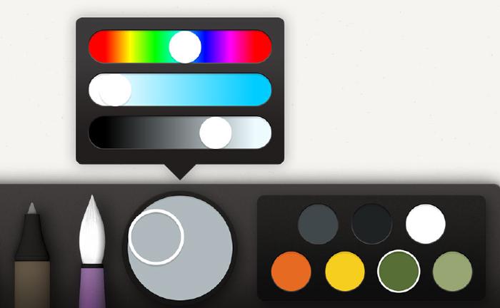
With guidelines placed, use the color mixer to choose a base color for the bricks. The mixture I decided on was a brown with some red and orange thrown in. Remember to mix a color about 25% lighter than what you’d like to end up with. We’ll be applying several layers of color to the bricks — if you mix it too dark you’ll end up with bricks that are almost black and lack dimension.
Laying bricks with watercolor
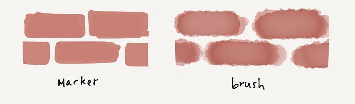
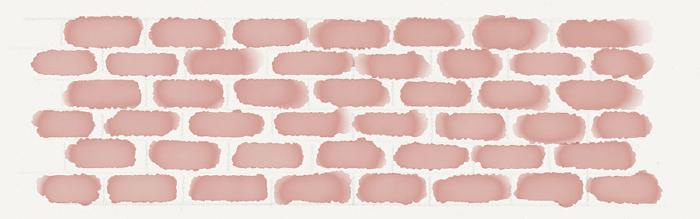
When blocking out bricks, I prefer using Paper’s watercolor brush instead of the marker tool. It leaves you with a jagged edge that’s closer to real life and looks more natural.
Painting small bricks is next to impossible if you don’t use a smart stylus like FiftyThree’s Pencil or a Pogo Connect Smart Pen. Without one you’re limited to a single brush size — which is too wide for this sort of detail work.
As you paint each brick, work a row at a time, using the pencil lines to guide you. For each row, take care to stagger bricks depending on the bonding pattern you’re going for and avoid stacking them vertically — doing so will look unnatural.
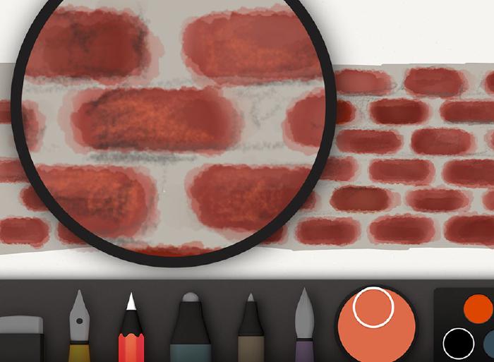
Once all the bricks have been laid, err painted — apply a second coat of watercolor to each. Painting fast and messy will add texture and a more natural look to the bricks.
Layers of watercolor don’t need to be exact. Apply until you reach a color to your liking.
Cement lines
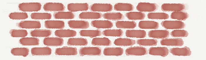
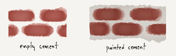
When coloring the cement between the bricks I approach it in one of three ways.
- Don’t do anything and leave it blank so the background color shows through.
- Mix a light gray and paint with the watercolor brush over all of the bricks, covering the spaces between them.
- Mix a light gray and use the marker tool to cover the bricks and spaces between them. Unlike the watercolor brush, a gray marker won’t mess with the brick color — unless it’s really dark.
At this point you could call it a day and consider the bricks finished. If you want to add some additional detail here are a few areas to focus on.
Adding detail to the bricks
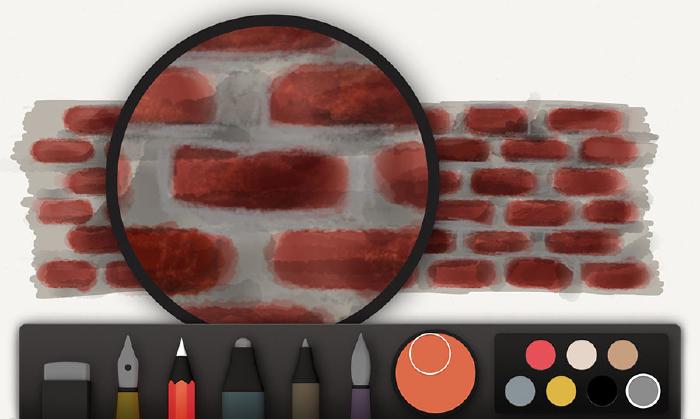
Add shadows to each of the bricks. Using a darker mix of the rusty brown from before (or a dark gray), paint shadow shapes on the bricks. You don’t want to cover the entire brick, just one of the corners depending on where the light is positioned in the scene.
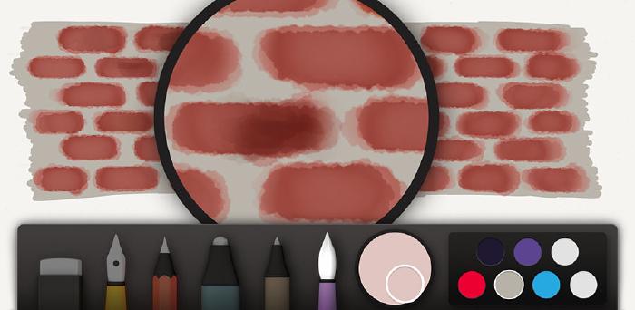
Using this same color (possibly with more black mixed in), a stroke of pencil below each brick is used to add small shadows. It can also be used to draw in cracks or add texture to the bricks.
I use the same technique but with a light orange color to draw in brick highlights and accentuate the cracks.
To finish off the bricks I’ll use a mixture of gray to further refine the spaces between the bricks and correct any shapes I don’t like. This step is completely optional and depends on how crisp you want your edges to look.
How to draw wood grain
Wood color varies quite a bit so I’m going to focus more on the process of digitally draw wood, and less on the colors used. The basic idea is to lay down a medium base coat and then work lighter colors on top of it.
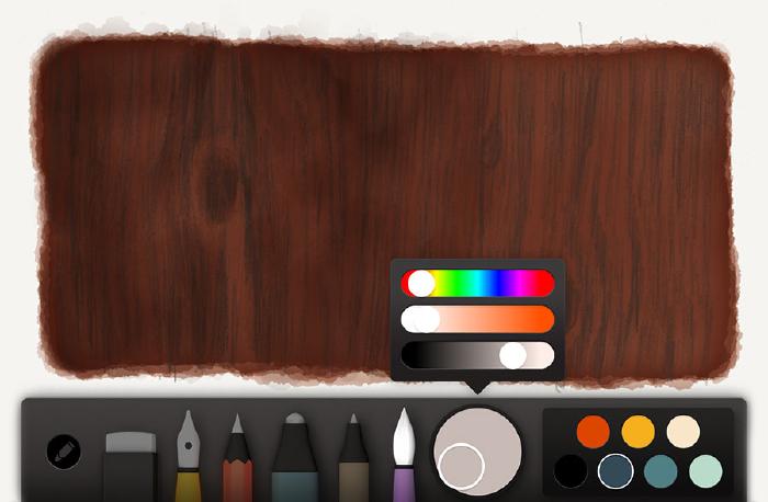
Selecting a base color
Determine what the mid-tone color of the wood is. Using the following photograph of wood as a reference, we can determine that it’s somewhere around a medium brown.
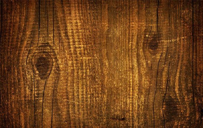
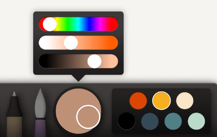
Mix your mid-tone color using Paper’s color mixer to match the photo above as best as you can. Then using the HSL sliders, reduce the brightness about 10%, and increase the saturation a bit until getting something that resembles this:
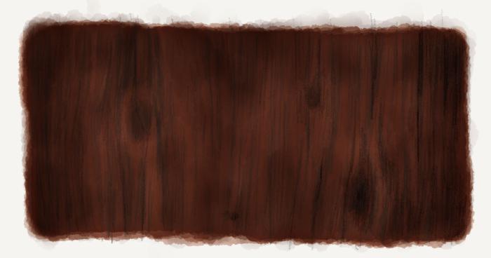
This becomes the base color and will be used to paint the wood’s shape with watercolor. For this first coat of watercolor, paint slowly to create an even and continuous tone. The idea with this base is to set the tone of the wood. We don’t want to go too dark or too light because we’ll be applying shadows and highlights and need enough contrast for the grain effect to work.
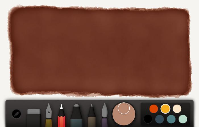
After several applications of watercolor you should have something that looks like this on your canvas.
Penciling in grain texture
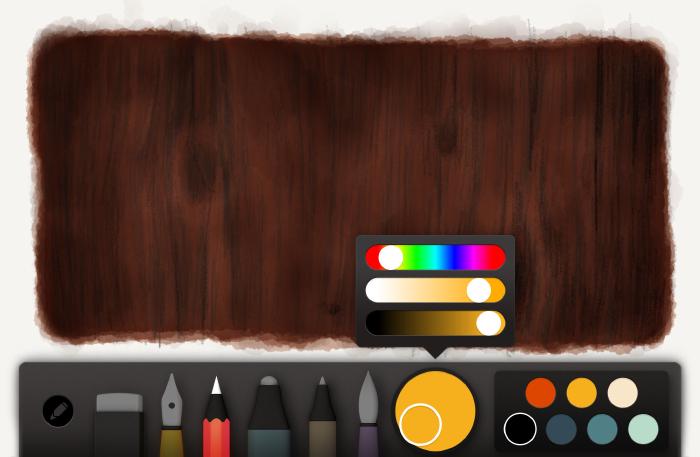
Now begins the fun of penciling in wood grain textures. Start by selecting the medium brown from before and mixing it about 10% darker. Depending on the temperature of the wood’s color it might be better to mix in a dark red to warm it, or a bluish green to cool it. Color is subjective so you might have to play with the hue if the color shifts out of harmony from the base.
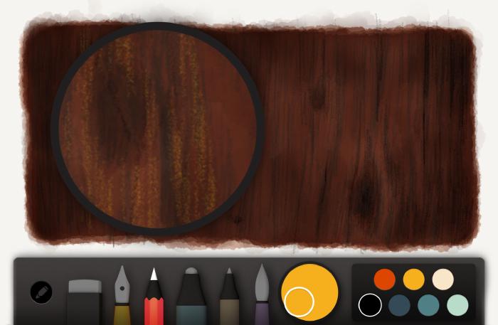
Using the pencil tool, begin sketching in fuzzy lines to represent wood grain. If you look back at our photo reference the grains go up and down — that’s the direction to follow.
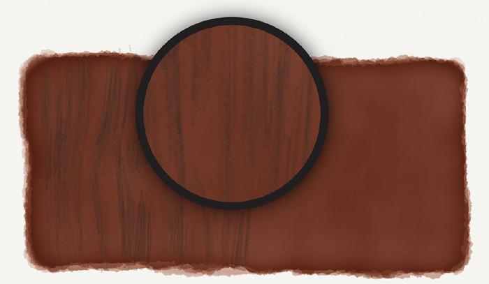
Without changing the color switch to the brush and splash in the wood’s darker spots. You may have to lighten the color some if it goes black too fast. Ideally you’ll build up the darker areas with layers to create rich tones.
Adding details
Black or an appropriate dark color can be used to draw in deeper cracks using the same fuzzy line technique from before. If wood knots exist, use this color to create oval shapes and fill them. If you keep these pencil strokes loose and sketchy they’ll match the other textures and unite visually.
Using the pencil tool and a dark color like black, draw in deeper cracks and knots in the wood.
For a final pass, mix a lighter variation of our base color. With this color and the pencil tool selected, sketch in a few highlights to add subtle texture to the wood. Keeping these strokes loose and fuzzy will help avoid over-powering the wood grain lines we drew earlier.
How to draw asphalt, gravel, and rocks
When drawing sidewalks, roads, or any sort of rocky terrain in Paper for iPad, I adapt the following process to fit most situations:
- Decide on a base color for the rocks.
- Paint several layers on top of each other using this base color and the paint brush tool.
- Mix up a darker variant of the base color.
- Sketch in random pencil strokes to add texture.
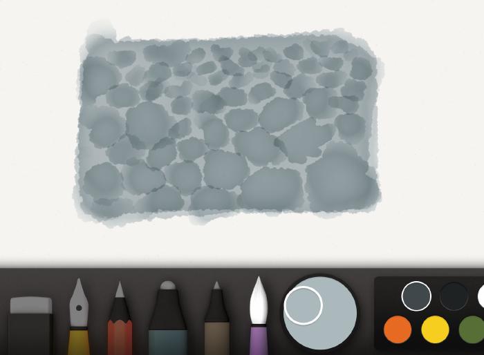
Painting a base
Here’s how it boils down in visual form. First mix up a base color to paint with. For the purpose of this guide let’s go with a gray blue.
Using the watercolor brush, paint a slow and even base layer. Keep adding layers until you’re happy with the color. You want it to make up the mid tone of your gravel, rocks, asphalt, or pebbles, so don’t go too dark or light because we want an adequate contrast between the shadows and highlights we’ll be adding next.
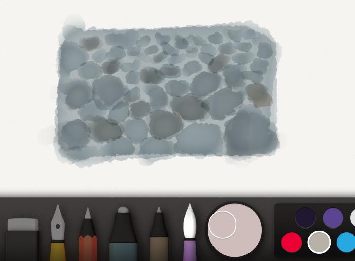
Applying texture
Going back to the color mixer, add in black or darken it with the sliders. You’re looking to reproduce a dark variation of the base we painted. Next select the pencil tool, zoom in, and begin sketching specks of dirt and cracks. Keep these strokes loose and random by moving around quickly — the fuzzier the better.
Using the exact same technique, mix a lighter color of the base and speckle in dirt and asphalt highlights.
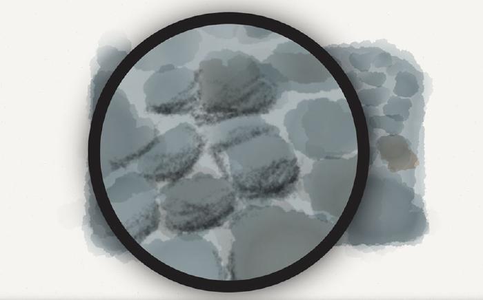
Painting large rocks
When drawing pebbles and large rocks, use the watercolor brush to create oval shapes instead. Don’t linger in a spot too long, the goal is to keep these shapes irregular and loose.
For more variation feel free to vary the color of the rocks by adding red or blue to the mix.
Using the pencil tool, draw in shadow lines along the bottom of each rock paying attention to where light is positioned. If the light is on the left, apply a shadow line to the bottom and right edges. If the light is coming from the right, add your shadows to the left. A reference photo will help you accurately determine their placement.
Harmonizing the rocks
To harmonize the rock’s color I’ll apply a layer or two of light gray (or variation of the base) over them all. This helps tie the shadow, highlight, and base colors together by tinting them.
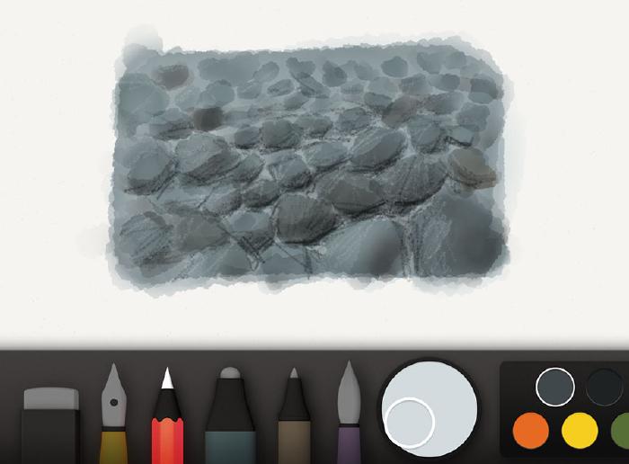
Depending on the color of this harmonizing layer, the highlights and shadows from before may have flattened out. To counter this, feel free to freshen them up using the pencil tool and color mixes from before.
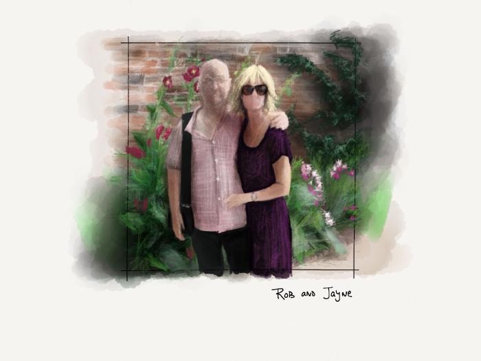
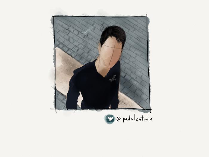
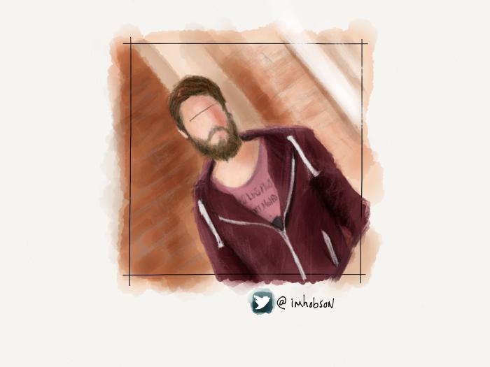
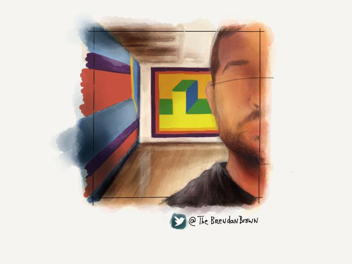
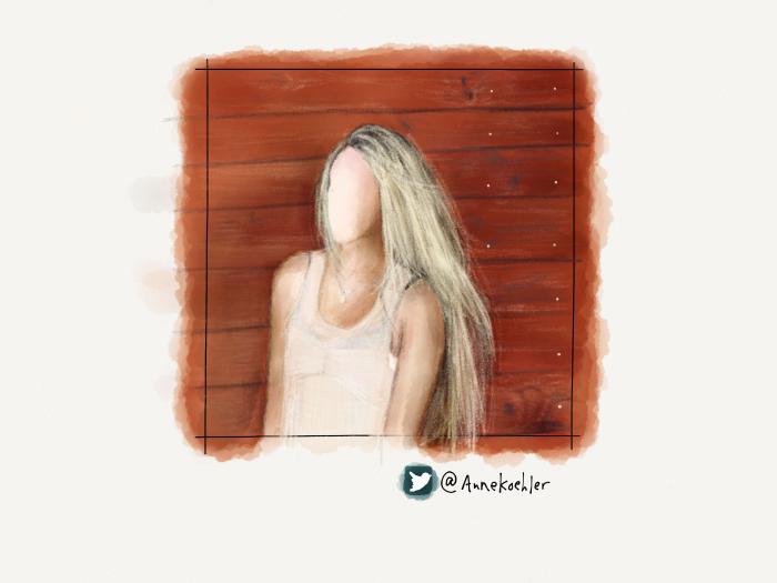
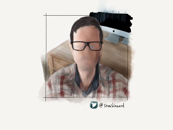
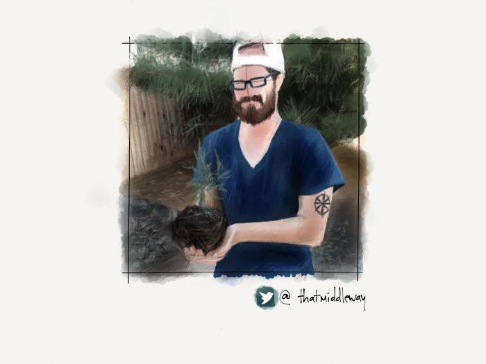
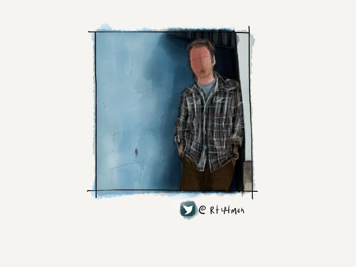
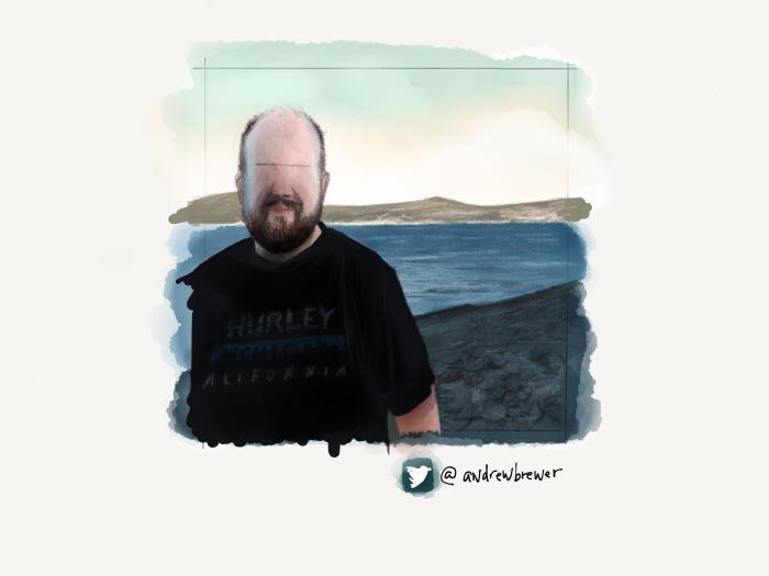
Variations on a theme
Using all of these techniques I was able to create a variety of backdrops for the portraits in my PaperFaces Project. Below are a few finished pieces to show what is possible by varying the color and composition.


In my next Mastering Paper tutorial I’ll share my skin tone cheat sheets I use for painting PaperFaces portraits. And demonstrate how I use shape, color, and Paper’s watercolor brush to enhance the realism of a portrait with little effort.
I like to draw loosely, avoiding anything that degrades the fun. My techniques focus more on getting the best results in the least amount of time, because who really wants to spend more than an hour on a drawing? ↩︎
8 comments
Superb tutorial once again, I shall have some fun trying these out over the next few days, thanx, the wood grain looks amazing!!
Nice work! Very, very good tips.
I just found your site a few days ago, I’ve been spending a lot of time reading all your tips on how to master Paper and I’m having a lot of fun! These are awesome tips and I hope to become a better artist, thank you for sharing your knowledge!
As usual very good tutorial. Learned a lot from this. Keep it up sir.
I’m just finding out about Paper and your wonderful tutorials. Quick question: can paper do layers?
Sadly Paper only has the single layer, which can make it quite challenging (and rewarding) to use in certain situations.
It’s hard to put the great pleasure I’m feeling into words. Your tutorials have been a breakthrough from sketching and watercolor ‘in the real world’ to going digital with ease. Thank you.