Building a living style guide with Jekyll
Building a living style guide that documents all of the colors, typographic elements, UI patterns, and components used on Made Mistakes has been at the top of my to-do list for some time.
As sole designer, developer, and writer for the site, having one probably isn’t all that crucial. Yet when iterating on the site’s design I’ve found that some of my patterns don’t always “speak the same visual language.” Having a document I can refer back to and quickly spot check for visual inconsistencies could be very helpful.
Start simple
With the attention style guides have gotten as of late, a nice selection of generators and tools have also matured in the open source community. Because I’m using Jekyll to publish the site, I felt it would be silly to use another tool to generate a living style guide. Even if that meant giving up the ease of setup these other tools provide by having to build out something myself.
Finding a way to do it all from within Jekyll was an important consideration since I wanted to “set it and forget it” as much as possible. Maintaining stylesheets and includes in two separate projects was a thought I didn’t really want to entertain…
So with that I bumped around GitHub to see what sort of solutions existed already and found these:
Out of the bunch, Jérôme Coupé’s approach resonated with me the most since it meshed well with my current Jekyll site setup. By leveraging collections1 I could avoid littering my _posts folder with components, color palettes, and other snippets while being able to iterate over them and output individual pages if needed.
Building the style guide
To start I took a quick audit of all the Sass partials in my _assets/stylesheets2 directory to determine how I might want to organize the style guide. The big takeaways for me were:
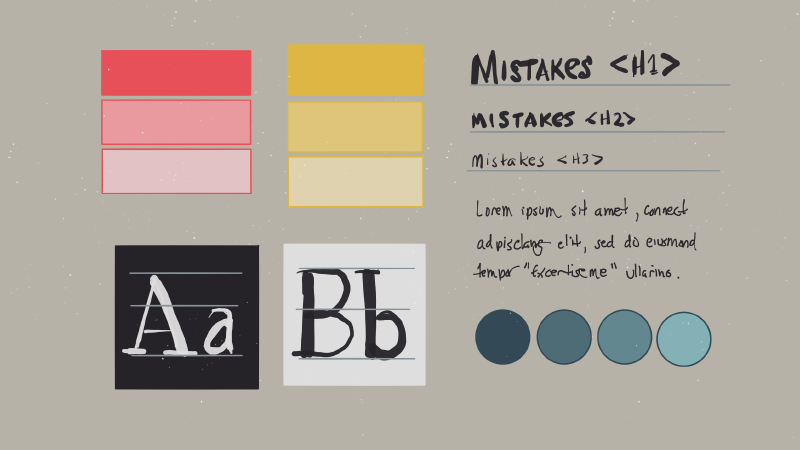
- Color palettes
- Typography (headings, paragraphs, lists, and inline elements)
- Media elements (images, figures, videos, etc.)
- Components (buttons, badges, table of contents, etc.)
Configure collections
With the structure of the style guide determined next came configuring the collections that would contain each component. Originally I planned to have a single collection named components but decided to go with a second to group together all of the color palettes used on the site.
Working with collections before when I built the FAQ section of the site, I had a good idea of what I was doing. To start I added the following to my _config.yml and created _colors and _components directories in the root of my project.
collections:
  components:
    output: false
  colors:
    output: false
I choose not to output a file for each color/component since I planned on grouping them together on a single page. But if I later wanted to break them out into separate pages (something I did for my FAQ section I would change output: false to true and configure their permalinks.
Style guide enhancements
For version 2.0 of the style guide I may investigate taking it to the next level by constructing a complete atomic design system. Instead of collections for components and colors I could create atoms, molecules, organisms, and templates to flush out the entire system.
I’ve seen examples of trying to do this in Jekyll with includes, but I think leveraging Jekyll collections, setting output: true on them, and getting creative with Liquid would make this a better option.
Display components and color palettes
With the two style guide collections configured I created a new layout to strip away most of the fluff found in my article and media layouts. It’s basically a wide wrapper with a page title and {{ content }} block.
---
layout: default
---

<div id="main" class="wrap" role="main">
  <h1>{{ page.title }}</h1>
  {{ content }}
</div><!-- /#main -->
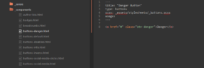
The bulk of the content for the style guide is going to come from creating Markdown files for each component and color palette. For components I used the following YAML front matter followed by the bare minimum of HTML needed to create each.
title and type are required keys, while scss, module, and usage are optional and describe a component and/or link back to their source code.
---
title: "Main content default Notice"
type: notices
scss: assets/stylesheets/_notices.scss
module:
usage: "Emphasize post text."
---

<div id="content" class="page-content">
  <div class="notice">
    <h4>Default Notice Headline</h4>
    <p>Donec sed tellus eget <a href="#">sapien fringilla nonummy</a>. Mauris a ante. Suspendisse quam sem, consequat at.</p>
  </div>
</div>
Collection loops
After creating a handful of components, I started to refine the Liquid layouts and includes needed to display them. Mostly to make sure things were shaping up how I envisioned them before getting too deep into things.
There’s not much magic going on here. The general idea is to:
Create a new page
/style-guide/index.mdto act as the style guide’s entry page.Add YAML front matter to this entry page.
title: Component name
layout: style_guide  # references the layout created earlier
description: Describes the component
Add introductory text to the style guide entry page.
Write a Liquid
forloops to output all documents found in thecolorsandcomponentscollections.
Here’s the simplified Liquid I came up with to fill the page with content from the components collection.
{% assign componentsByType = site.components | group_by:"type" %}
{% for type in componentsByType %}
  <h2 id="guide-{{ type.name }}" class="cf">{{ type.name | capitalize }}</h2>
  {% for entry in type.items %}
    {% include component.html %}
  {% endfor %}
{% endfor %}
What’s going on here is I’m iterating over the components collection, grouping the documents by type3, and displaying each document’s content twice (rendered HTML and syntax highlighted un-rendered HTML).
Sandwiched between the entry loop I used a Jekyll include that takes care of spitting out the rendered and syntax highlighted HTML along with an optional short description and links to Sass and include sources.
<div class="component">
  <div class="component-header">
    <h3 id="guide-{{ entry.title | slugify }}">{{ entry.title }}</h3>
    {% if entry.usage %}
      <p><strong>Usage:</strong> {{ entry.usage }}</p>
    {% endif %}
    {% if entry.module %}
      <p><strong>Include file:</strong> <a href="{{ site.owner.github-repo }}{{ entry.module }}">{{ entry.module }}</a></p>
    {% endif %}
    {% if entry.scss %}
      <p><strong>SCSS file:</strong> <a href="{{ site.owner.github-repo }}{{ entry.scss }}">{{ entry.scss }}</a></p>
    {% endif %}
  </div><!-- /.component-header -->
  <div class="component-main">
    <div class="component-rendered">
      {{ entry.content }}
    </div><!-- /.component-rendered -->
    <div class="component-code">
      {% highlight html %}
        {{ entry.content }}
      {% endhighlight %}
    </div><!-- /.component-code -->
  </div><!-- /.component-main -->
</div><!-- /.component -->
Component selector navigation
To help expose components that may be buried towards the bottom of the page I came up with option list navigation. Which arguably should be solved in more semantic and accessible way.
<nav id="component-selector" class="wrap">
<select name="section" id="component-select">
<option value>Jump to component...</option>
<option value="#guide-color-palettes">Colors</option>
{% for type in componentsByType %}
<option value="#guide-{{ type.name }}">{{ type.name | capitalize }}</option>
{% for entry in type.items %}
<option value="#guide-{{ entry.title | slugify }}"> {{ entry.title }}</option>
{% endfor %}
{% endfor %}
</select>
</nav>
<!-- component selector option list -->
<script>
(function (document, undefined) {
// component selector
document.getElementById('component-select').onchange = function() {
var val = this.value;
if (val !== "") {
window.location = val;
}
}
})(document);
</script>

With the help of some CSS and JavaScript I was able to position a drop down list in the lower right corner as a way of jumping around the page. If and when I get to going full atomic design on the style guide, I may have to rethink this sort of navigation by giving it more prominence in the layout. But for now it is functional…
Stylesheet tweaks
For the most part the components rendered correctly on the page. One of the benefits of building the style guide was that it pointed out components that weren’t as modular as I initial thought. Meaning some were bound to specific class names that when placed in different contexts, behaved in unexpected ways.
There were also cases where I needed to add styles specific for the style guide in order for things to display correctly. The colors collection is a good example of that.
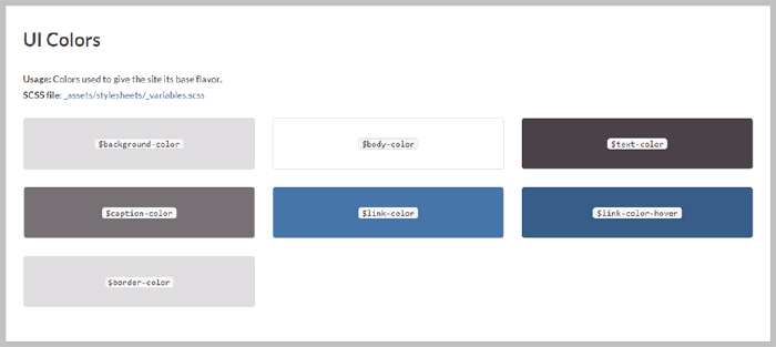
My goal here was to avoid hard coding color values into each document, and instead leverage the color variables already set in /assets/stylesheets/_variables.scss to keep things DRY.
To achieve this I used a SassScript map of all the color variables found on the site along with some CSS to build the swatch tiles.
.color-tile {
  @include span-columns(4);
  @include omega(3n);
  margin-bottom: $gutter;
  padding: $gutter 0;
  text-align: center;
  border-radius: $border-radius;
  border: 1px solid $border-color;

  code {
    @include font-size(16,no);
    color: $text-color;
    white-space: nowrap;
    margin: 0 2px;
    padding: 0 5px;
    border: 1px solid $code-border-color;
    background-color: $inline-code-background;
    border-radius: $code-border-radius;
    white-space: normal;
  }
}
Maintaining the style guide
Updating and adding components to the style guide should be as simple as creating a new Markdown file and placing it in the _components directory. In a perfect world I would never have to touch the Markdown files of existing components.
Cosmetic changes made to Sass files should ripple throughout the site without my intervention. Unfortunately, for those components that undergo markup changes, I’ll have to repeat myself and edit two files… something that shouldn’t happen too frequently.
As always my code is available on GitHub for download and forking. The Style Guide is integrated with the rest of Made Mistakes so you may have to rip out some stuff if you end up using it.
Be sure and let me know if this has been useful. If I get enough feedback I’ll consider breaking it out into its own repository for easier forking.
A feature added to Jekyll in version 2.0.0 allowing you to define new types of documents that behave like pages or posts, while also having their own unique properties and name-spaces. ↩︎
I’m using the excellent Jekyll 3 Assets plugin for a Rails-like asset pipeline to run AutoPrefixer, minify and MD5 fingerprint CSS/JavaScript assets, and some other useful stuff. ↩︎
Component type is set in the YAML Front Matter. eg: buttons, notices, media, typography, etc. ↩︎
12 comments
Hey Michael! Thank you for sharing. Since I saw the pattern library by Mail Chimp I wanted to create a style guide and already began. Like you, I want to do it with Jekyll. But doing it with a dedicated collection didn’t cross my mind. Thank you for all your insights. Thank you for sharing your ideas and knowledge.
Excellent. Glad it was helpful!
Hey Michael how hard would it be to install Jekyll on digital ocean (or a VPS)?
I feel like I’ve seen some blog posts talking about how to do it if you Google around. But personally I don’t have experience with it. I’ve only ever built locally and rsync’d my content or used GitHub Pages.
Let me try it and see.
Not good :(
Cool thing !
As always this is goldmine! Thank you for the time you put in to research and share Jekyll tips!
Did you figure out how to use rendered collection documents (
output: true) as includes? Seems that this way there’d be a single point of reference for every component. Both the styleguide and the UI would be using the same component code and changes to component markup would have to be done only once.The thought never occurred to me to output the collection documents as includes. That would be pretty cool if you could output to
_includesto DRY things up.But I get the feeling that folder is probably reserved by Jekyll, or that it would end up outputting to
_site/_includeswhich wouldn’t help.Worth some testing though.
Hey Michael, thanks for replying!
Just thought of another slightly quirky way of achieving this DRY-ness.
What if a component markup is stored in
_includes/components/btn.htmland the collection document includes it via{% include components/btn.html text="click me" %}? This could also be a nudge to liquidify the components for reuse in multiple contexts (e.g., same button with different copy)This is exactly how Hugo Giraudel proposes building a living style guide with Jekyll. It’s something I’ve been meaning to adapt for my site, just haven’t had the time.
A bit late to the conversation, but I want to note that you can include Markdown in the Frontmatter in an HTML by using a pipe to escape the content. This is what I used for my Jekyll styleguide